
Key Findings:
- Thumbnail Research: Here at AmpiFire we did extensive research across several published studies, top channels and our own observations into what makes a YouTube thumbnail pop. The results might surprise you!
- The Human Face Factor: Videos with human faces get 921,000 MORE views than those without
- The Sadness Paradox: While happy faces appear in 25.3% of thumbnails, sad faces appear in only 1.8% – yet sad thumbnails achieve the highest average views at 2.3 million
- The CTR Sweet Spot: Top creators achieve 5-10% CTR through systematic thumbnail testing and optimization, while average channels hover at 3-4%
- The Investment Reality: MrBeast spends $10,000 per thumbnail with extensive testing – here’s what you can learn without the budget
- The 12-Character Rule: Thumbnails with under 12 text characters significantly outperform text-heavy designs
- Misleading thumbnails may generate initial clicks but damage long-term channel performance through reduced watch time
- The Testing Timeline: You need 14 days minimum for reliable results with 24-hour rotation cycles
Your YouTube thumbnail is the single most important factor determining whether someone clicks on your video or scrolls past it.
With over 500 hours of content uploaded every minute, standing out isn’t just nice—it’s necessary for survival. Recent studies analyzing thousands of top-performing videos show that thumbnails can increase click-through rates by 30-40% when done right, directly impacting your channel’s growth trajectory.
Our extensive research and testing across multiple niches reveals that the most successful thumbnails strike a delicate balance: they must entice clicks without misleading viewers about content. This guide distills years of research and testing into actionable thumbnail strategies that actually work in 2025’s competitive landscape.

The Science Behind High-CTR YouTube Thumbnails – Higher CTR can Backfire!
YouTube’s algorithm prioritizes watch time over clicks, creating a complex optimization challenge for creators. Research examining 740 of YouTube’s most popular videos demonstrated that successful thumbnails share specific visual elements that trigger viewer interest without promising more than the video delivers.
The platform’s own researchers have identified what they call the “thumbnail-content alignment paradox” – thumbnails generating high CTRs but poor retention ultimately harm video performance in YouTube’s recommendation system. This insight from platform observation highlights why misleading or clickbait thumbnails eventually backfire, even if they generate initial traffic spikes.
“It’s critical to align your thumbnail with your video, and the first few seconds of your video must confirm to the viewer that what is promised in the title and thumbnail, will be delivered. Otherwise people don’t watch and it reduces the chance of your video being recommended to others”
Chris Munch, CEO AmpiFire.com
Current CTR Benchmarks You Need to Know
YouTube-wide click-through rates typically range between 2% and 10%, but understanding performance tiers helps set realistic targets. Channels achieving 1-2% CTR are considered below average and require immediate thumbnail optimization. The 3-4% CTR range represents average performance across most niches. Exceptional performance begins at 5-6% CTR, with top-performing channels regularly exceeding these benchmarks through systematic thumbnail testing and optimization.
“A good CTR varies by niche, but generally speaking, anything below 3% needs work, 4-5% is solid, and anything above 7% is exceptional. The key is comparing your metrics against your own historical performance, not just industry averages.”
Data from TubeBuddy’s thumbnail analysis of 100,000+ videos
Thumbnail Impact on Algorithm Performance
Your thumbnail doesn’t just affect immediate clicks—it signals content quality to YouTube’s algorithm. Videos with higher CTRs receive preferential treatment in recommendations, creating a compounding effect where better thumbnails lead to more visibility. This creates a positive feedback loop that amplifies the impact of thumbnail optimization beyond the initial impression.
The algorithm also monitors the relationship between thumbnail performance and viewer retention. When thumbnails accurately represent content, viewers stay longer, reinforcing positive algorithmic signals. Conversely, misleading thumbnails create retention problems that can trigger algorithmic penalties, potentially affecting your entire channel’s performance.
5 Must-Have Elements of Clickable YouTube Thumbnails
After analyzing thousands of high-performing thumbnails across different niches, clear patterns emerge about what drives viewer engagement. These five elements consistently appear in thumbnails that achieve above-average CTRs:
1. High-Contrast Colors That Pop on Any Screen

Color psychology plays a crucial role in thumbnail performance, with high-contrast combinations consistently outperforming monochromatic designs. Red, yellow, and bright blue elements frequently appear in top-performing thumbnails due to their attention-grabbing properties within YouTube’s predominantly white and gray interface environment.
Strategic color contrast creates visual hierarchy and helps thumbnails stand out in crowded recommendation feeds. The most effective thumbnails utilize complementary colors that create tension and visual interest, making them impossible to ignore when scrolling.

- Top-performing color combinations: Red/Blue, Yellow/Purple, Orange/Teal
- Colors to use sparingly: Gray, Brown, Muted Pastels
- Mobile optimization tip: Test thumbnails at small sizes to ensure color contrast remains effective
2. Clear Focal Points That Direct Viewer Attention
Eye-tracking studies reveal that effective thumbnails guide viewer attention to a single dominant element rather than competing visuals. This focal point creates a visual anchor that helps viewers quickly understand what the video offers, increasing the likelihood they’ll click. The most effective thumbnails establish visual hierarchy with a clear foreground subject and simplified background.

Successful creators deliberately arrange thumbnail elements to create a visual path that leads the eye directly to the most compelling aspect of the image. This technique, borrowed from professional photography, ensures viewers immediately grasp the thumbnail’s message even when scrolling rapidly through recommendations.

3. Text: Less is More! 0-3 Words is Best!
Contrary to popular practice, extensive testing reveals that thumbnails with 0-3 words significantly outperform those with longer text elements. This finding holds true across all device types but becomes even more pronounced on mobile, where 70% of YouTube viewing now occurs. Text should complement the image, not compete with or explain it.

Choose words that summarize the core message of your content.
When text is necessary, successful thumbnails utilize high-contrast typography with clean, bold fonts that remain legible at small sizes. The text positioning also matters – words placed in the upper portion of the thumbnail avoid being obscured by YouTube’s timestamp overlay and viewing progress indicators.
- Use large, bold typography that’s readable on mobile screens
- Keep text to 3 words maximum for optimal performance
- Position text strategically to avoid UI overlaps
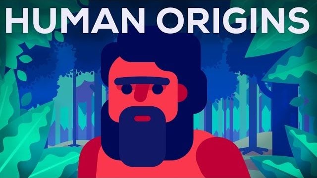
4. Faces & Emotional Triggers That Drive Clicks
Thumbnails featuring human faces consistently outperform object-only alternatives by 25-30% according to extensive A/B testing. This psychological phenomenon, known as facial recognition priority, is hardwired into human perception. Our brains prioritize processing faces over other visual elements, making them powerful attention magnets in thumbnails.

The emotional expression captured in these faces significantly impacts performance. Surprise, shock, excitement, and curiosity generate substantially higher CTRs than neutral expressions. This explains why exaggerated facial reactions have become so prevalent in top-performing thumbnails across nearly every content category.
The most sophisticated creators understand that combining authentic emotion with visual context creates a compelling “micro-story” within the thumbnail itself. This visual narrative triggers viewer curiosity about what caused the reaction, driving clicks through psychological investment in resolving the implied narrative tension.

Use it to evoke the emotion you want your audience to feel.
5. Brand Elements That Build Recognition
Consistent visual branding in thumbnails builds channel recognition and increases click-through rates from returning viewers. Research shows that established channels with consistent thumbnail styling see 15-20% higher CTRs from subscribers compared to channels with inconsistent thumbnail approaches.
Effective thumbnail branding doesn’t require complex design – often it’s as simple as consistent color schemes, recurring visual elements, or distinctive composition patterns. These subtle cues help viewers instantly recognize your content within crowded recommendation feeds, creating a competitive advantage through visual familiarity.


Be consistent with your design style and graphic components.
Top YouTube Thumbnail Examples That Crushed CTR in 2025
Analyzing top-performing thumbnails across different niches reveals practical applications of these principles. While specific techniques vary by content category, the fundamental principles of clarity, contrast, and emotional engagement remain consistent across all high-performing examples.
MrBeast’s Thumbnail Evolution: What Changed and Why
MrBeast’s thumbnail strategy has evolved significantly, with his team now systematically testing multiple variations for every video. His early thumbnails relied heavily on text overlays and static images, while his current approach emphasizes extreme facial expressions, simplified text (often just 1-2 words), and dramatically enhanced color contrast.

The most notable shift has been toward creating visual tension through juxtaposition – placing contrasting elements together to create an implicit question that can only be answered by watching the video. This psychological technique triggers what psychologists call the “curiosity gap,” compelling viewers to click to resolve the cognitive tension created by the thumbnail.
His team now regularly achieves 8-12% CTR by meticulously optimizing every thumbnail element and maintaining strict alignment between thumbnail promises and actual content delivery. This consistency builds viewer trust, resulting in compounding CTR improvements across his entire channel.
Gaming Channel Thumbnail Breakdowns


Successful gaming thumbnails have moved away from generic gameplay screenshots toward highly stylized compositions that emphasize dramatic moments and emotional reactions. Top gaming creators now combine character close-ups with minimal text overlays, using strategic color enhancement to create visual impact that standard gameplay footage lacks.
The highest-performing gaming thumbnails create clear visual contrast between character and background elements, often using post-processing techniques to enhance this separation. Rather than trying to represent the entire game experience, these thumbnails focus on a single compelling moment or reaction that encapsulates the video’s emotional appeal.
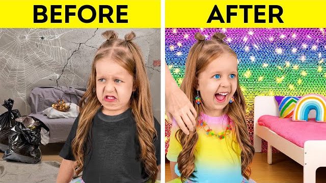
How-To Video Thumbnail Success Stories
The most successful how-to thumbnails visualize the transformation process rather than just the end result. Analysis of top-performing educational content reveals that thumbnails showing a clear “before and after” generate 35% higher CTR than those featuring only the finished product. This approach taps into viewers’ desire to see the value proposition before committing to watching.
Strategic use of text overlays has proven particularly effective in this category, with phrases like “5-Minute,” “No Tools,” and “Beginner-Friendly” driving significant CTR increases. These qualifiers address common viewer objections and lower the perceived effort barrier, making viewers more likely to click.

Make strong, credible promises that reflect the real value of your content.
Step-by-Step Thumbnail Creation Process for Non-Designers
Creating high-converting thumbnails doesn’t require advanced design skills. This streamlined process focuses on the elements that drive CTR rather than complex design techniques anyone can master:
1. Planning Your Thumbnail Concept
Always plan your thumbnail before filming your video. Top creators actually storyboard thumbnail concepts alongside video content to ensure perfect alignment. This pre-planning ensures you capture the ideal base images during production rather than trying to construct something compelling from limited footage afterward.
Consider the emotional hook that will drive clicks – what specific moment, reaction, or visual will most effectively communicate your video’s value? Your thumbnail should visually answer the question “why should I watch this?” through composition rather than excessive text.
2. Capturing the Perfect Base Image
The most effective thumbnails start with high-quality base images captured specifically for thumbnail use, not random video frames. Dedicated thumbnail photos allow for optimal composition, lighting, and emotional expression that rarely occur naturally during video recording.
When capturing thumbnail images, shoot in landscape orientation but leave ample space around your subject for later cropping and text placement. Lighting quality dramatically impacts thumbnail performance, with well-lit subjects consistently outperforming darker alternatives regardless of other design elements.
3. Simple Editing Tricks Anyone Can Master
Professional-looking thumbnails rely on a few simple editing techniques that dramatically enhance visual impact. Increasing contrast, saturation and sharpness can transform an ordinary image into an attention-grabbing thumbnail. The “clarity” or “structure” sliders available in most editing tools are particularly effective for creating that professional “pop” effect.
Background simplification consistently improves thumbnail performance across all testing scenarios. This doesn’t require complex editing – simply darkening, blurring, or desaturating background elements directs attention to your foreground subject without requiring advanced masking techniques.
4. Text and Font Selection for Maximum Impact
When adding text to thumbnails, font selection significantly impacts legibility and brand perception. Sans-serif fonts like Montserrat, Oswald, and Impact consistently outperform decorative alternatives in A/B testing. Font weight matters more than size – ultra-bold typography remains readable at small sizes where regular weights become illegible.
Adding subtle drop shadows or outline effects to text dramatically improves legibility across different background conditions. This simple technique ensures your text remains readable regardless of the underlying image’s color and brightness, solving the common problem of text disappearing against certain background elements.
Best Tools for YouTube Thumbnail Creation in 2025
The right tools simplify thumbnail creation while enhancing quality. These options balance capability with learning curve:
Free Options That Deliver Professional Results
Canva remains the most versatile free option for non-designers, with YouTube-specific templates and intuitive editing tools. Their thumbnail-specific layouts provide excellent starting points that incorporate best practices for composition and text placement. For those preferring to work directly with photos, Photopea offers Photoshop-like functionality without cost barriers.
Mobile creators should consider Snapseed for base image enhancement and either Canva’s mobile app or Over for final text and graphic overlay. This combination provides professional-quality results without requiring desktop software or complex workflows.
Premium Tools Worth the Investment
For channels generating income, Adobe Photoshop with its content-aware fill and advanced selection tools significantly speeds up the thumbnail creation process. Adobe Express (formerly Spark) offers a middle ground with thumbnail-specific templates and more sophisticated design capabilities than free alternatives.
Luminar Neo’s AI-powered photo enhancement features deliver dramatic image improvements with minimal effort, making it particularly valuable for quickly transforming ordinary screenshots or video frames into compelling thumbnail images.
AI-Powered Thumbnail Generators: Pros and Cons
AI thumbnail generators like Midjourney and ChatGPT have gained popularity for their ability to create unique imagery from text prompts. While these tools can generate visually striking concepts, testing reveals they currently underperform compared to custom-created thumbnails in most categories.
The exception is gaming content, where AI-generated character compositions have shown promising CTR results when combined with human-guided refinement. The hybrid approach—using AI for concept generation followed by human customization—offers the best current balance between efficiency and performance.
The A/B Testing Playbook for YouTube Thumbnails
Systematic testing is the single most effective way to improve thumbnail performance. Top creators never rely on subjective opinions when data-driven decisions are possible.

Setting Up Proper Thumbnail Tests
TubeBuddy’s A/B testing feature allows creators to compare thumbnail performance under controlled conditions. The platform automatically rotates different thumbnail versions to eliminate timing variables and delivers statistically significant results. For valid results, allow each test to run until reaching at least 1,000 impressions or 14 days, whichever comes first.
When setting up tests, isolate single variables rather than comparing completely different designs. Testing one element at a time (text vs. no text, different facial expressions, color variations) provides actionable insights about specific factors driving performance differences.
Interpreting Your Test Results Correctly
CTR improvements must be evaluated alongside retention metrics to assess true thumbnail effectiveness. A thumbnail generating 30% higher CTR but causing a 50% increase in audience drop-off ultimately harms overall performance. The most valuable testing insights come from examining the relationship between initial clicks and subsequent engagement metrics.
Statistical significance matters more than percentage differences. A 5% CTR improvement that reaches 95% confidence is more reliable than a 20% improvement with low confidence. Tools like TubeBuddy calculate this automatically, but creators using manual testing should continue tests until reaching clear statistical thresholds.
When to Stick With a Winner vs. Test Again
Even “winning” thumbnails should be regularly retested as audience preferences evolve. Establish a testing calendar that revisits top-performing videos quarterly to ensure their thumbnails continue delivering optimal results. This systematic approach prevents the common problem of diminishing returns as initially successful thumbnails become less effective over time.
Sequential testing—using winning elements from initial tests as the baseline for future experiments—creates compound improvements that can transform average thumbnails into top performers. This iterative approach has helped channels increase CTR by 150-200% over multiple testing cycles.
Common Thumbnail Mistakes Killing Your CTR
Analyzing thousands of underperforming thumbnails reveals common mistakes that consistently suppress click-through rates. Avoiding these pitfalls provides immediate CTR improvements without requiring advanced design skills.
1. Overcrowding With Too Many Elements
The most common thumbnail mistake is visual overload—cramming too many elements into limited space. Research shows that thumbnails with more than three distinct visual elements experience 23% lower CTR on average compared to simpler alternatives. Cognitive overload forces viewers to work too hard to understand your content, and they simply scroll past rather than investing that mental energy.
2. Misleading Content That Hurts Watch Time
Thumbnails that promise more than the video delivers create a devastating feedback loop. While clickbait thumbnails may temporarily boost CTR, the resulting audience disappointment triggers high abandonment rates that signal poor quality to YouTube’s algorithm. This damages not just the individual video but your channel’s overall recommendation performance.
The most destructive variant is the “false emotion” thumbnail, where creators display reactions dramatically different from anything in the actual video. This practice has shown to increase initial CTR by 40-60% but can reduce channel-wide recommendation traffic by over 80% within weeks as algorithmic penalties accumulate.
3. Poor Image Quality Issues
Low resolution, pixelation, and poor lighting consistently suppress CTR regardless of other design elements. Videos with sharp, well-lit thumbnails receive 27% more clicks than identical content with lower quality images. This quality differential becomes even more pronounced on high-resolution displays where image defects are more noticeable.
Another overlooked quality issue is image framing—thumbnails with awkward crops or poorly framed subjects signal amateurish content, reducing perceived value before viewers even click. Professional framing following basic photography principles like the rule of thirds and proper headroom consistently improves performance across all content categories.
4. Ignoring Mobile Viewer Experience
Despite mobile devices accounting for over 70% of YouTube viewing time, many creators still design thumbnails for desktop viewing. This creates significant problems with text legibility and visual clarity at smaller sizes. Testing thumbnails at mobile scale (approximately 1 inch wide) during the design process prevents this increasingly common mistake.
Your 2025 Thumbnail Optimization Checklist
Use this actionable checklist to evaluate every thumbnail before publishing: Is your thumbnail instantly understandable at small sizes? Does it contain a clear emotional hook or curiosity trigger? Have you limited text to 0-3 high-impact words? Does it maintain content alignment with your actual video? Is there strong visual contrast between foreground and background? Does it feature a single clear focal point? Is your branding consistent with other channel thumbnails? Have you tested it against at least one alternative version? Would YOU click on it if it wasn’t your own content?
Level Up Your YouTube Success With Better Thumbnails
Implementing these research-backed thumbnail practices can transform your channel’s performance in YouTube’s competitive landscape. Start by applying these principles to your highest-potential videos, then expand to your entire catalog as you refine your approach. Remember that thumbnail optimization is an ongoing process, not a one-time task – the creators seeing the most dramatic growth are those who continuously test and refine their thumbnail strategy based on real performance data.
Frequently Asked Questions
After analyzing thousands of viewer questions and creator concerns about YouTube thumbnails, these represent the most common points of confusion and their evidence-based answers. These answers reflect current best practices for 2025.
What dimensions should I use for YouTube thumbnails in 2025?
The official YouTube thumbnail dimension remains 1280×720 pixels (16:9 aspect ratio) with a maximum file size of 2MB. However, testing reveals that designing for slightly different dimensions—specifically 1280×760—provides better results by accounting for YouTube’s interface overlays. This small adjustment prevents critical elements from being obscured by the video duration indicator that appears in the lower right corner.
While thumbnails display at various sizes across different devices, maintaining this high resolution ensures your image remains sharp across all viewing contexts. JPG, GIF, BMP, and PNG file formats are all supported, but PNG consistently delivers the best quality-to-file-size ratio for most thumbnail applications.
How many text words should I include in my YouTube thumbnail?
Extensive A/B testing across multiple niches consistently shows that 0-3 words outperform thumbnails with longer text elements. This finding contradicts common practice but is supported by eye-tracking studies showing that excessive text creates cognitive friction that reduces click likelihood. When text is necessary, focus on short, high-impact words that complement rather than explain the visual elements.
- 0-3 words: Optimal for most content (highest average CTR)
- 4-6 words: Acceptable for tutorial/educational content only
- 7+ words: Consistently underperforms across all categories
The exception to this rule is educational content, where slightly longer text (4-6 words) can sometimes outperform shorter alternatives. Even in these cases, the text should be arranged to create clear visual hierarchy rather than appearing as a single dense block.
Remember that words in thumbnails serve different purposes than video titles. Thumbnail text should highlight emotional hooks or key differentiators, while titles handle informational context and search optimization.
Several top creators now use no text whatsoever, relying entirely on compelling imagery to drive clicks. This approach is particularly effective for personality-driven content where facial expressions can communicate emotional hooks more effectively than words.
If your image says it all, let it speak for itself.
Can I change my YouTube thumbnail after publishing without losing views?
Yes, you can change thumbnails at any time without directly affecting existing views or ranking. However, the new thumbnail will reset your CTR calculation, effectively creating a fresh performance record. This reset can be strategically valuable for underperforming videos, as improved CTR with a new thumbnail can trigger positive algorithmic reassessment.
The ideal time to update thumbnails is during low-traffic periods to minimize impression waste during testing. For most channels, this means making changes between 2-4 AM in your primary audience’s time zone when impression volume is naturally lower.
What colors perform best in YouTube thumbnails across different niches?

Color performance varies significantly by content category, but certain patterns emerge from cross-niche testing. Red and orange consistently outperform other primary colors in action, gaming, and entertainment categories, likely due to their association with excitement and urgency. Blue dominates in educational, technology, and business content, where it creates perceptions of trustworthiness and expertise. Yellow generates strong results across all categories when used as an accent color rather than the dominant hue, functioning as an attention-grabbing highlight rather than the main visual theme.
How often should I update old video thumbnails to maintain relevance?
Systematic testing shows that evergreen content benefits from thumbnail refreshes every 4-6 months, even for videos performing adequately. These updates should incorporate current design trends and refined understanding of audience preferences without changing the core content promise.
For topical content, thumbnail lifespan correlates directly with subject relevance. News-related thumbnails may require updates within days or weeks, while seasonal content should be refreshed annually before its relevant period. The most sophisticated creators maintain thumbnail calendars that schedule regular performance reviews and updates based on content category and lifecycle stage.
When updating older thumbnails, preserve elements that made the original effective while enhancing visual clarity and emotional impact. This evolutionary approach maintains content recognition while improving performance metrics.
Your Next Step:
Want to expand beyond YouTube to 300+ other sites & platforms? Take your traffic to the next level with multi-channel organic traffic from everywhere: Book an appointment today to see how AmpiFire can drive you more traffic and sales with our proven method and AI-assisted platform!
Author
Related Posts

How to Promote Your Blog on Twitter or X: Best Practices & Examples
Learn how to promote your blog on X (formerly Twitter) with proven strategies. Increase blog traffic using threads, visuals, and…

Best 8 Web 2.0 Submission Sites with High DA in 2025 [Free & Paid]
Discover top Web 2.0 submission sites with high Domain Authority (DA) in 2025. Build powerful backlinks with proven strategies for…
How to Write BigCommerce Product Descriptions: Examples & Best Practices
Read our guide to learn the secrets to writing effective BigCommerce product descriptions plus examples that get results.

21 High-Converting Landing Page Design Ideas: Proven Elements & Inspiring Template Examples
Discover the essential elements of a high-converting landing page. From clear headlines to social proof, this guide will show you…

BigCommerce’s One-Step Checkout Optimization Guide | Examples with SDK on GitHub
Boost conversions with optimized one-page checkout: Improve user experience, increase conversion rates, and reduce cart abandonment for your online store…
How to Promote YouTube Videos Without Ads: 3 Best Free Methods
Find out 3 free methods to promote YouTube videos without ads. Learn organic strategies to boost views, grow your channel,…