Are you ready to take your landing pages from mediocre to mesmerizing? You’re in luck! We’ve scoured the web, analyzed the data and distilled it down to the essential elements that make a landing page effective and converting. From crafting a compelling headline to using social proof, we’ve got you covered. So, grab a notebook and pen, and get ready to take your landing page game to the next level!
The Key Elements of an Effective and Converting Landing Page: From Clear Headlines to Conversion-Centered Layouts
A landing page is a standalone webpage that is designed to convert visitors into customers or leads. To ensure that a landing page is effective, it is essential to create a tailored message that resonates with the target audience and captures their attention, so that they are compelled to take the desired action.
There are several key elements that make a landing page effective and converting:
- A clear and compelling headline: The headline is the first thing that visitors will see on the landing page, so it’s important that it is clear, concise, and attention-grabbing. Crafting an effective headline requires knowing the audience, understanding the message, and conveying it in a way that will draw attention. It should also match the ad or link that the visitor clicked on to get to the page, creating a sense of relevance and consistency.
- A strong and persuasive value proposition: A value proposition is a statement that explains the unique benefit of the product or service and how it will solve the visitor’s problem. It should be written in a way that is clear and compelling, providing visitors with an incentive to move further down the sales funnel. This should be prominently displayed above the fold, so it is immediately visible to visitors and they understand the purpose of the page.
- Social proof: Social proof is the use of testimonials, reviews, badges, and other forms of evidence that demonstrate the popularity and credibility of a product or service. The use of social proof on a landing page can increase trust and credibility with visitors, which will lead to a higher conversion rate.
- A single, focused offer: A landing page should have a clear and singular focus, with one primary offer and call-to-action (CTA). This helps visitors to understand the purpose of the page and can increase the chances of them taking the desired action.
- A conversion-centered layout: The layout of a landing page should be designed with the goal of converting visitors in mind. This includes the use of whitespace, color, contrast, and directional cues to make the CTA stand out and be more easily visible. Incorporating 3d elements can also enhance the visual appeal and draw more attention to key areas. It’s worth noting that creating a landing page that converts requires testing and optimizing. A/B testing different versions of your landing page, and making changes based on the results, can help you to continuously improve your conversion rate.
It’s worth noting that creating a landing page that converts requires testing and optimizing. A/B testing different versions of your landing page, and making changes based on the results, can help you to continuously improve your conversion rate.
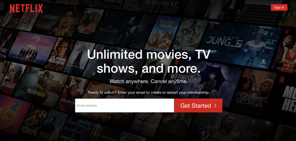
1. Netflix
The Netflix landing page is an excellent example of an effective and converting landing page, not only it uses several key elements that are known to boost conversion rates, such as a clear and compelling headline, social proof, a single, focused offer, and a conversion-centered layout but also it has features that make it stand out in its industry.
What we like about it?
- A One-Field Form: Netflix uses a one-field form on the landing page, which makes the first step of signing up simple and easy for visitors, this could appeal to a wider audience including those who are not tech-savvy.
- Drop-Down FAQ: Netflix has a drop-down FAQ section at the bottom of the page, this allows them to address any pricing concerns without making it a big deal and preventing visitors from clicking away from the page.
- Short-Form Content: Netflix uses short-form content on the landing page, this allows visitors to quickly digest the information and understand the benefits of signing up. According to the 2021 Conversion Benchmark Report, media and entertainment landing pages with less than 350 words tend to convert better.
- Killer Value Proposition: Netflix offers a killer value proposition of unlimited movies and TV shows for less than $10 a month, this makes the service seem almost too good to be true and appeals to a wide range of audiences.
- Reinforcement of Benefits: Netflix’s landing page effectively reinforces the most important benefits of the service, such as the vast selection of movies and TV shows, without making it seem complicated or difficult to sign up.
- Industry-Specific Features: Netflix’s landing page also includes features that are specific to its industry, such as a “Start your free trial” button and a section highlighting popular shows and movies.
- Strong Visuals: Netflix uses strong visuals on the landing page, such as images of popular shows and movies, which helps to grab visitors’ attention and create a sense of excitement about the service.
- Mobile-Friendly Design: Netflix’s landing page is designed to be mobile-friendly, which is important as a significant portion of visitors will likely be accessing the page on their mobile devices.
Netflix’s strategy has been working well, recent reports show that the streaming service has over 192 million subscribers worldwide, demonstrating its high conversion rate.
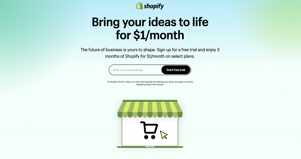
2. Shopify
The Shopify landing page is a great example of how to design a high-converting landing page by keeping it simple, easy to navigate, emphasizing the key features and benefits of the product and adding credibility and social proof. It’s another great inspiration for those looking to create a landing page that converts.
What we like about it?
- Clean Interface: The page has a simple and clean layout with a user-oriented headline and short paragraphs that make it easy to understand the product and its benefits.
- Concise CTA: The CTA is easy to fill out with only a few fields required, which makes it easy for visitors to quickly get started with the platform.
- Trusted by Many: The page notes that the platform is trusted by over a million businesses, which adds credibility and social proof to the offer.
- Emphasize Security: Emphasizing the security aspect of the platform helps to eliminate friction for visitors with security concerns.
- Easy to Navigate: The page is easy to navigate, making it easy for visitors to understand the product and take action.
- Highlighting Key Features and Benefits: The page highlights the key features and benefits of the platform, which helps to persuade visitors to sign up for the trial.
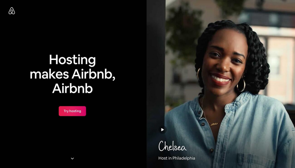
3. Airbnb
Airbnb’s landing page is a great example of effective design and user experience. The page immediately showcases their unique offering – the ability for users to book unique accommodations around the world – and provides easy access to searching for and booking a stay. Additionally, the page incorporates elements that increase trust and social proof, making it clear that Airbnb is a reliable and widely-used platform.
What we like about it?
- Personalization: the landing page personalizes the experience for potential hosts by showing them what they could potentially earn based on their location and the size of their home. This is an effective way to appeal to people who are still figuring out how much they should charge and what they can expect to earn. It also makes the process of becoming a host more tangible, which can help to increase conversions.
- Simple and Easy-to-Use Search Function: The search function is prominently displayed and easy to use, allowing users to quickly find and book a stay.
- Trust and Social Proof Elements: The page includes customer testimonials, a count of the number of listings, and trust badges from major publications and organizations, making it clear that Airbnb is a reliable and widely-used platform.
- Crisp and Visually Appealing Design: The page uses high-quality images and a clean design to showcase the variety of listings available on Airbnb and create a sense of adventure and excitement.
- Clear and Prominent Call-to-Action (CTA): The clear call-to-action at the top of the page makes it easy for visitors to convert on the spot. This provides a smooth user experience and makes it easy for people to take the next step, whether they are looking to book a stay or become a host.
4. Zillow
The Zillow landing page is a simple and effective high-converting design that is optimized for both SEO and user experience. With a clear headline, high-quality images, and a prominent call-to-action, the page is designed to attract users and guide them towards taking action.
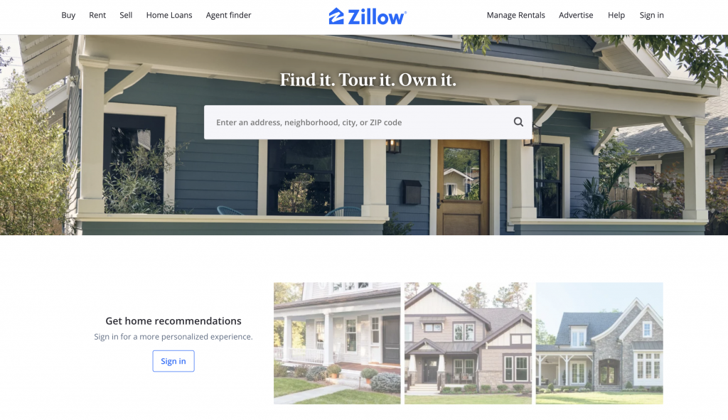
What we like about it?
- Strong Headlines: The headline on the Zillow landing page is clear and attention-grabbing, making it easy for users to understand the purpose of the page and what they can expect to find there. This is important because it helps the page rank for relevant keywords and phrases.
- High-Quality Images: The use of high-quality images on the page helps to draw the users’ attention and create an emotional connection with the page, which can help to increase conversions. This is important for design because it helps create a more visually appealing and engaging experience for users.
- Clear Call-to-Action: The call-to-action on the page is prominently displayed, making it easy for users to take action and start searching for homes. The page prompts users to sign-up to continue, once you hand over your email, you’ll have access to more data like comparable homes in the area, mortgage tools, and the estimated net profits should you decide to sell.
- Optimized for Local Search: The page is optimized for local search by including location-specific keywords and phrases, making it more likely to rank for local search queries and attract users looking for homes in the area. Zillow has access to a vast amount of housing and neighborhood data, which makes it one of the top home search sites in the nation. The address itself is used to denote the home’s neighborhood and to give an estimate of the property’s worth.
5. Woolx
The Woolx landing page is a great example of a high-converting page due to its use of high-quality visual elements and effective promotions. The page showcases a stylish and comfortable brand piece of clothing made from 100% Australian Merino wool.
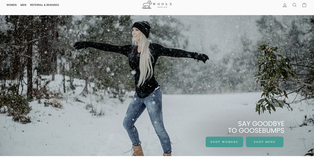
What we like about it?
- Eye-catching photography: The use of high-resolution photography on the landing page allows visitors to get an up-close and personal look at the product and imagine themselves wearing it. The photos span the entire width of the page, making them impossible to ignore.
- Sticky Bar Promotion: A sticky bar at the top of the page offers a 10% discount for visitors, which is a great way to improve the click-through rate and motivate people to switch from browsing to buying.
- Feature Video: The video on the page shows a woman preparing for an early-morning bike ride by lacing up her shoes and zipping up her sweater. This is a subtle way of reinforcing the brand’s target audience and lifestyle, which can help to increase conversions.
- Highlighting the Unique Selling Point: The fact that it is made of 100% Australian Merino wool is highlighted prominently, this helps in creating a brand positioning in the customer’s mind, and also highlights the unique selling point of the product.
- User-Friendly Navigation: The Navigation menu is clear and easy to use, allowing users to easily find the information they are looking for and increase the chances of conversion.
6. Webprofits
Webprofits is a digital marketing agency that helps companies with their online growth. Their landing page is a great example of how to effectively communicate the value of their services and make it easy for visitors to take action.
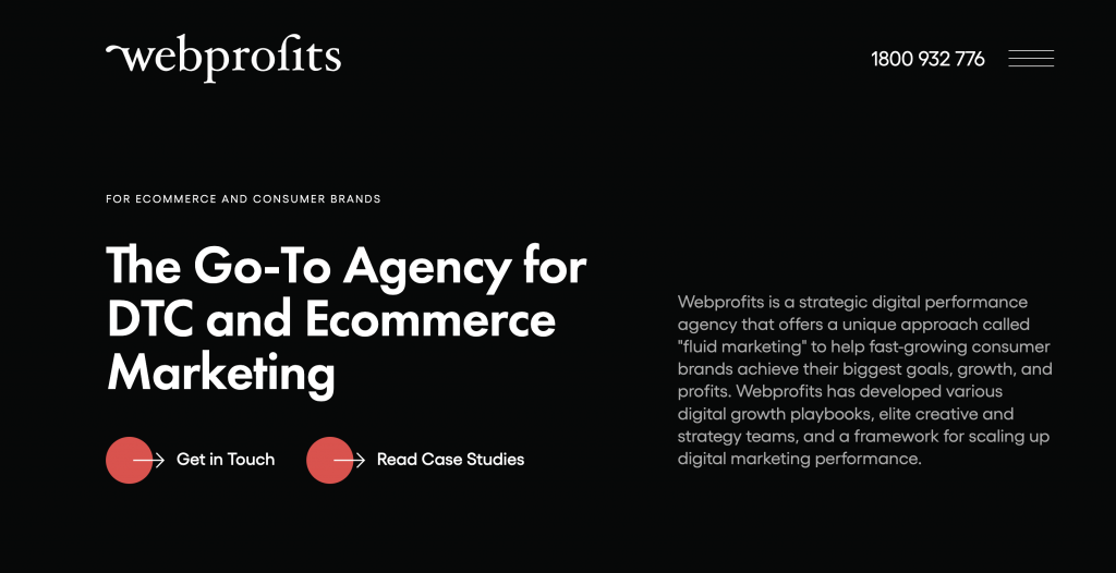
What we like about it?
- User Testimonials: The page prominently features testimonials from satisfied clients, which can help to establish trust and credibility with visitors and make them more likely to convert.
- Clear Explanation of Services: The page does an excellent job of clearly explaining what Webprofits does and the benefits of working with them. This can help to quickly communicate their value to potential clients and make it easy for them to understand how they can help.
- Multiple CTAs: The page includes multiple calls-to-action, such as “Get in Touch” and “Book a Consultation” making it easy for visitors to take the next step and contact the company.
- Strategic Use of Quotes: The page uses quotes from satisfied clients, which can help to establish trust and credibility with visitors and make them more likely to convert.
- Great Design and layout: The page has an attractive and modern design, which can help to create a positive first impression and make it easy for visitors to navigate and find the information they are looking for.
7. Impactplus
The landing page of Impactplus is a powerful example of how to effectively use design and messaging to attract and convert potential customers. This page is optimized for lead generation and it’s design and messaging reflect that.
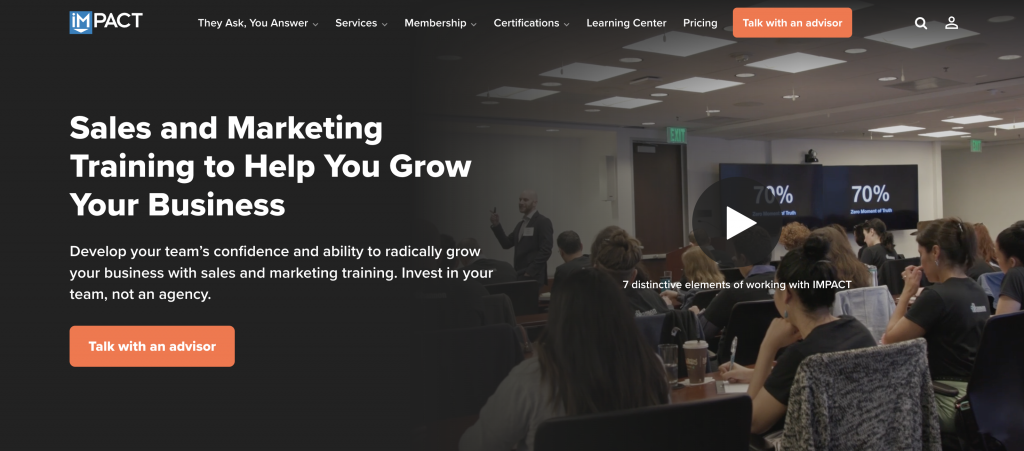
What we like about it?
- Video Testimonials: Impactplus has a number of professionally made video testimonials from users which help build trust and credibility with potential customers. Seeing real people talk about their positive experiences with the company can be a powerful motivator for people to take action.
- List of Resources: Impactplus also includes a list of resources such as e-books, video courses, that help to establish the company’s authority in their field. This can be a great way to help potential customers get a better sense of what they can expect from working with the company.
- Clever Messaging: The messaging on the page is well thought out and designed to be compelling. Instead of simply asking visitors to download an ebook, the page encourages them to “generate more conversations.” This rephrasing is far more enticing and makes visitors more likely to take action.
- Simple Use of Color and Fonts: The blue tones used on this landing page are pleasing to the eye and give the page a cohesive look. The simple font used on the page is easy to read and helps visitors focus on the important information.
- Strategic CTAs: The page includes strategic CTAs throughout, such as “Get in Touch” which makes it.
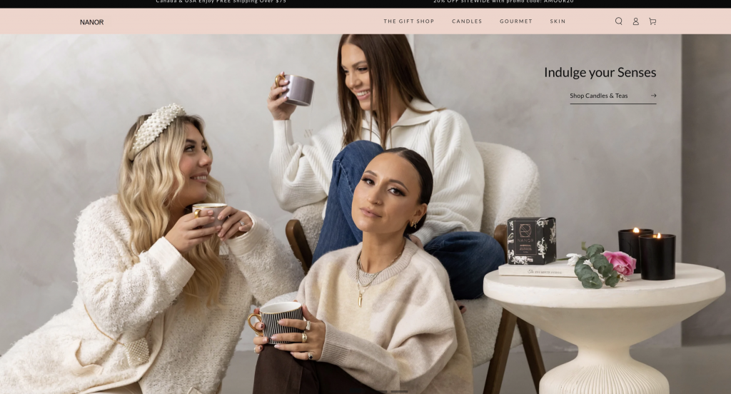
8. Nanor
The Nanor’s landing page is a great example of how to effectively showcase a product and create an emotional connection with potential customers. The page is specifically designed to showcase NANOR’s scented candles, and it does an excellent job of highlighting the luxury and wellness experience that the candles offer.
What we like about it?
- Vivid and Beautiful Photography: The page features a variety of high-quality images that showcase the candles and the various scents they offer. The images are carefully selected to evoke emotions and create a sense of luxury and wellness that aligns perfectly with the product and brand.
- Dark Background: The black background of the page is used to create an upscale and premium atmosphere that highlights the product and makes it stand out. The dark background is a clever design choice that helps to put the candles in the best possible spotlight
- “Add to cart” button: The page includes a prominent “Add to cart” button that makes it easy for visitors to buy right on the landing page. This helps to increase conversions and make it easy for visitors to take action.
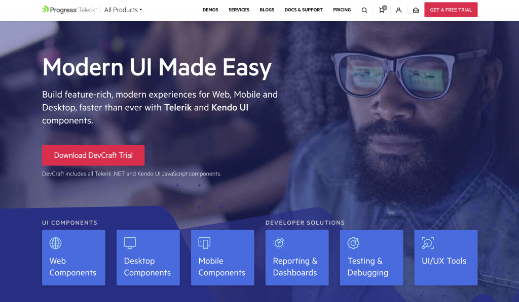
9. ProgressTelerik
Progress Telerik provides software development services for businesses of all sizes. Their powerful landing pages is designed to attract developers looking for a modern user interface solution. The page has several key elements that make it high-converting and powerful.
What we like about it?
- Strong Headline: The headline “Modern UI Made Easy” on the Telerik landing page is clear and attention-grabbing, making it easy for users to understand the purpose of the page and what they can expect to find there. It effectively communicates the value proposition of the product.
- Prominent Call-to-Action: The “Download DevCraft Trial” button is prominently displayed, making it easy for users to take action and try the product.
- Trust Indicators: The page includes logos of prominent companies that Telerik has partnered with, as well as a list of awards they have received, which can help to increase trust and credibility with users and make them more likely to convert.
- News Featured: The page also features recent news about Telerik, which helps to keep users informed about the company’s latest developments and helps to increase engagement with the page.
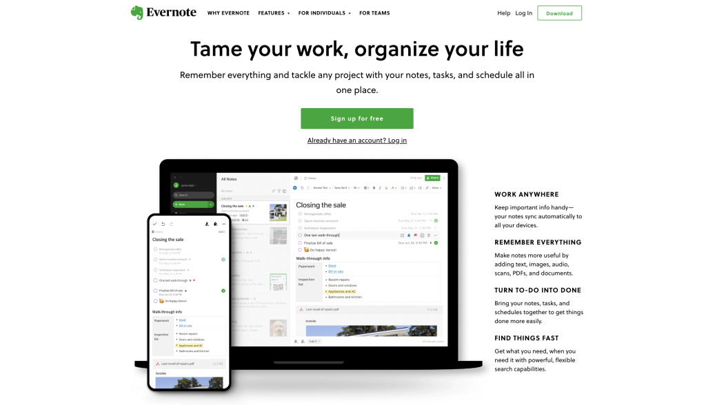
10. Evernote
Evernote.com is a great example of a landing page that effectively converts visitors into users. The page features a variety of elements that work together to create a seamless user experience and encourage visitors to take action.
What we like about it?
- Software Demo: The landing page features a video demo of the software that gives visitors a quick and easy way to understand the key features of the app. The video is short, engaging, and provides a quick overview of the app’s capabilities.
- Short and Real User Testimonials: These testimonials provide social proof and help build trust with visitors by highlighting the real-world success that other people have had with the app.
- Clean Layout and Minimalistic Design: By keeping the design simple and uncluttered, Evernote is able to effectively highlight the key features of the app and make it easy for visitors to understand what the app does and how it can benefit them.
- Scrolling animation: While it’s difficult to tell from the static screenshot above, this site captures your attention with its subtle use of animation while scrolling down the page. This is a clever way to organize information without interfering with user experience.
- Primary Call-to-action: The primary call-to-action (CTA) is prominently displayed on the page, making it easy for visitors to take the next step and download the app. Overall, the combination of these elements make the Evernote landing page a great example of how to effectively convert visitors into users.
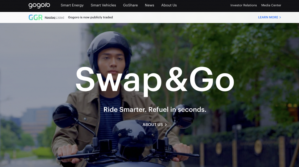
11. Gogoro
The landing page of Gogoro Network, a company that specializes in smart electric scooters and energy solutions, is a great example of effective design and storytelling. The website’s tagline “Ride Smarter. Refuel in seconds” immediately communicates the brand’s value proposition and sets the tone for the rest of the page.
What we like about it?
- Tagline: The tagline is short and simple, yet it effectively communicates the brand’s value proposition, which is the convenience and efficiency of the smart electric scooters.
- Brands powered by Gogoro Network: This section showcases the brands that use Gogoro Network’s products and services, which helps to build trust and credibility with potential customers.
- Interactivity: The website is highly interactive, it invites visitors to explore and discover the brand’s products and services in an engaging way.
- High-quality photography: The landing page is filled with vivid and high-quality images that effectively showcase the brand’s products and lifestyle. These images are powerful in evoking emotions and encouraging visitors to envision themselves using the brand’s products.
- Simple and elegant design: The landing page’s design is simple and elegant, which allows visitors to focus on the key features of the brand’s products and services. The use of white space and minimalistic design elements make the page easy to navigate, and improves the user experience.
12. ExpressVPN
ExpressVPN is a leading provider of virtual private network (VPN) services, and their landing page is a great example of how to effectively convert visitors into customers. The page is clean, simple, and focused on one primary goal: to entice visitors to start a risk-free trial of their service.
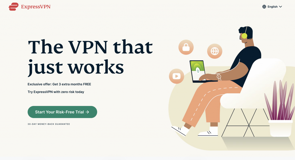
What we like about it?
- Clear call-to-action: The “Start Your Risk-Free Trial” button is prominently displayed and stands out against the clean white background. This makes it easy for visitors to understand what the next step is and what action they should take.
- Lack of navigation: By removing the navigation bar, ExpressVPN puts the focus solely on the primary CTA. This approach has been shown to increase conversion rates, as it reduces the risk of visitors getting distracted and leaving the page before taking action.
- Simple, minimalistic design: The page is designed with a clean and modern aesthetic, which helps to create a sense of trust and professionalism. The use of white space and a limited color palette also makes the page easy to read and navigate.
- High-quality images: The page features high-quality images that are used to illustrate the benefits of the service, such as increased privacy and security. These images help to create a sense of urgency and highlight the value of the service being offered.
13. Dr. Shefaly’s Coaching Institute
The landing page for the Institute of Dr. Shefali is an excellent example of a landing page that is designed to convert visitors into leads and customers. By using a combination of persuasive design elements, social proof, and clear and concise messaging, the landing page effectively communicates the value of the Institute’s programs and helps to increase conversions.
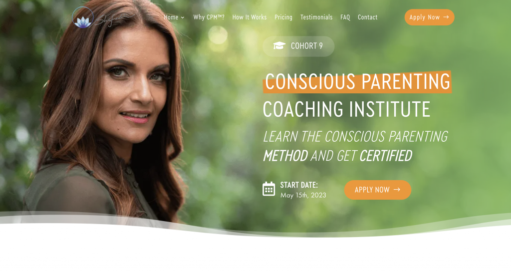
What we like about it?
- Meeting objections head-on: The landing page makes it clear what visitors can expect after they apply by listing a Q&A section right beside the form. This helps to alleviate any concerns or objections that visitors may have about handing over their personal information, which can help to increase conversions.
- Use of video and written testimonials: The landing page features a variety of video and written testimonials from satisfied customers. These testimonials serve as social proof, providing visitors with real-life examples of how the Institute has helped others. This can help to build trust and credibility, making it more likely that visitors will convert.
- Clear and concise messaging: The landing page uses clear and concise language to communicate the benefits of the Institute’s programs. This helps to make it easy for visitors to understand what the Institute can offer them, which can increase the chances that they will convert.
- Use of persuasive design elements: The landing page makes use of persuasive design elements such as color, typography, and imagery to create an attractive and engaging experience for visitors. These elements can help to increase engagement and encourage visitors to take action.
14. Uber
Uber is another brand that has a powerful, user-friendly landing page that effectively communicates the message and encourages visitors to take action.
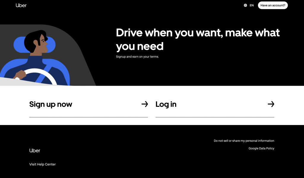
What we like about it?
- Headline: The headline “Drive when you want, make what you need” effectively captures the essence of the Uber platform. It highlights the flexible work hours and the opportunity to earn money as a driver.
- Black and White Color Scheme: The black and white color scheme provides a professional and clean look that is both modern and easy on the eyes.
- Skimmable Content: The short and easily-digestible sentences make it easy for visitors to quickly grasp what Uber is all about.
- Simple Form: The simple form on the page makes it easy for visitors to sign up to drive with Uber. It requires only a few essential details, making the sign-up process quick and straightforward.
15. ClassCreator
The Classcreator.io landing page, designed as a homepage, is designed to showcase the product’s features and primary benefits, targeting high-level decision-makers who need as much information as possible before they buy.
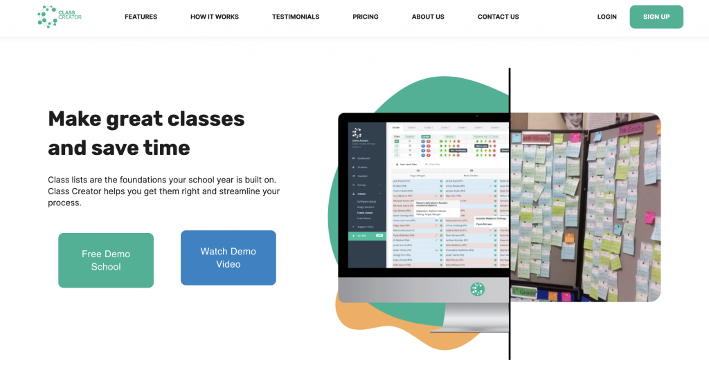
What we like about it?
- Floating navigation bar: The navigation bar is always in view, making it easy for visitors to navigate the page. This also keeps the primary call-to-action at the top of the page, eliminating the need for scrolling.
- Social proof: The landing page prominently displays numbers of customers using the software, creating a sense of trust and credibility with visitors.
- Clean layout: The landing page uses a clean and minimalistic design, with a clear layout and hierarchy of information which makes it easy for visitors to navigate and understand the information on the page.
16. Intercom
Intercom is a company that offers cutting-edge conversational bot technology and boasts one of the sleekest landing pages on the web. The page’s design and features effectively drive its value proposition to potential customers.
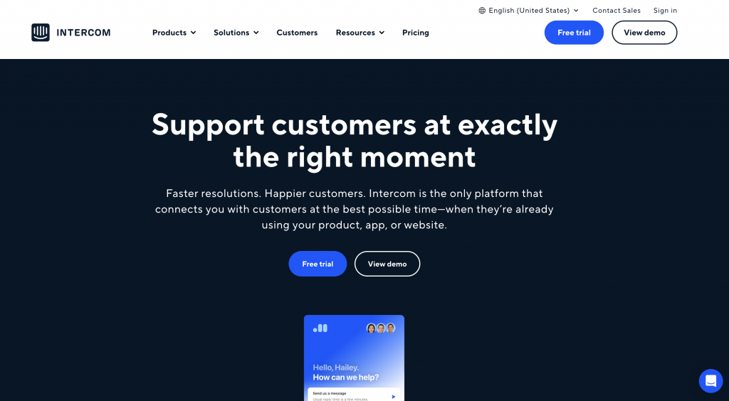
What we like about it?
- Breathtaking CSS animations: Intercom’s use of animation on its landing page adds a visual element that effectively showcases the company’s product and its capabilities.
- Attractive and consistent design: The page’s design is both visually appealing and consistent with Intercom’s brand, which helps to build trust with potential customers.
- Seven precise benefits outlined: The landing page succinctly outlines seven key benefits of using Intercom’s conversational bot technology, which helps to quickly communicate the value proposition to visitors.
17. Lyft
The ride-hailing service Lyft has a landing page that successfully entices drivers to join their platform. The landing page is a great example of how a clean, simple, and well-designed page can be effective in attracting new users.
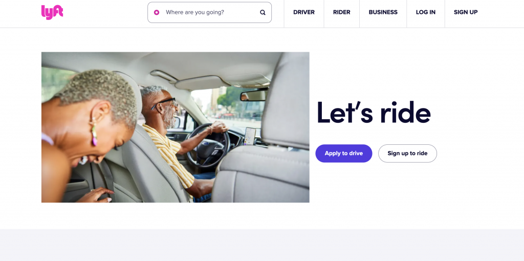
What we like about it?
- Consistent branding: The landing page reflects Lyft’s well-established brand identity through the use of its iconic pink color and recognizable logo. This helps to establish trust and credibility with potential new drivers.
- Fast sign-up form: The page features a sign-up form that is easily accessible and straightforward. It is placed prominently above the fold, making it quick and easy for Uber drivers to start the process of joining Lyft.
- Comprehensive FAQ section: The page also includes a detailed FAQ section, which addresses common questions and concerns that Uber drivers may have about switching to Lyft. This information helps to provide a more informed and confident decision-making process, ultimately leading to a higher conversion rate.
18. Spotify
Spotify’s landing page is an excellent example of a simple yet effective landing page that effectively captures the attention of visitors and entices them to sign up.
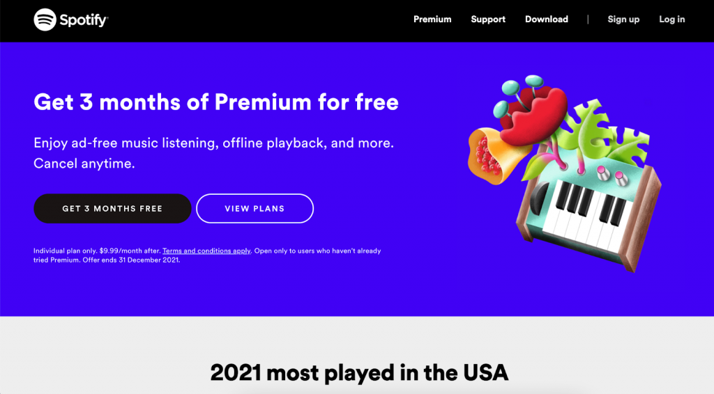
What we like about it?
- Color Scheme: The landing page’s stark color contrast (white and black) emphasizes the text and calls-to-action, making it easier for visitors to focus on the important elements.
- Promoting Content Library: The page lists the most played artist, song, album, and podcast of the year, which is a creative way to showcase the breadth of Spotify’s content library and attract visitors to sign up.
- Simple and Direct: The page is simple, clean, and easy to navigate, which allows visitors to focus on the main message and the call-to-action.
- Different Purpose Signaling: The change in color scheme from Spotify’s classic green and black signals to visitors that the landing page serves a different purpose from the rest of its content, making it more appealing and memorable.
19. Databricks
Databricks is a powerful and effective landing page that showcases the company’s cloud-based analytics platform. It’s a great example of how a landing page should be designed to entice visitors to convert. The landing page effectively balances a clean design with informative content to educate visitors on the value of the service.
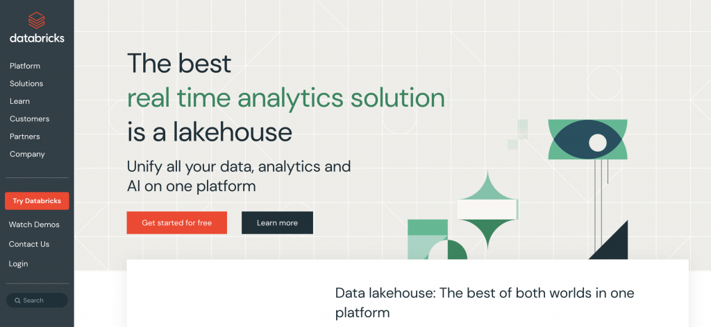
What we like about it?
- Clear goal conversion: The landing page has a clear goal of converting visitors into customers. It does this by highlighting the key benefits of the platform and making it easy for visitors to sign up or schedule a demo.
- Education on the service: Databricks provides information and insights on how the platform can save time and streamline the data analysis process.
- Clean design: The landing page looks clean and modern, with a simple color scheme and a minimal design. This helps remove any friction that may be preventing visitors from converting.
- Highlighting the value of the product: The landing page highlights the time-saving value of the product, emphasizing the competitive pricing and the pain point it solves. This information helps visitors make an informed decision on whether the service is right for them.
20. Slack
Slack, a team communication tool, has become one of the most popular communication platforms with over 12 million daily active users. Its landing page perfectly showcases the product’s capabilities and attracts potential users to sign up.
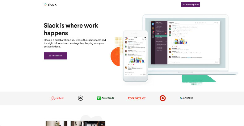
What we like about it?
- Attractive and descriptive product screenshots: Slack’s landing page showcases the product’s key features and functionalities through attractive and descriptive screenshots. This gives the potential user an idea of what the product can do, making it easier for them to understand the value proposition.
- Clear CTA placed above the fold: Slack’s landing page has a clear call-to-action (CTA) placed above the fold, encouraging visitors to start using the platform. This positioning of the CTA makes it easier for users to take action, as they don’t have to scroll down the page to find it.
- Bright, enticing, and consistent branding: Slack’s landing page features bright, enticing, and consistent branding that aligns with the company’s image and messaging. This consistency across the page reinforces the brand and makes it easier for users to identify the product.
- Social proof that’s placed high up the page: Slack leverages its extensive user base by featuring social proof high up on its landing page. This testimonial serves as an endorsement and highlights the product’s popularity, making it easier for visitors to trust the product and take action.
21. Canva
Canva.com’s landing page is a great example of how design and functionality can work together to create an effective and user-friendly experience. From its attractive design to its straightforward structure, Canva’s landing page is optimized to attract and retain visitors.
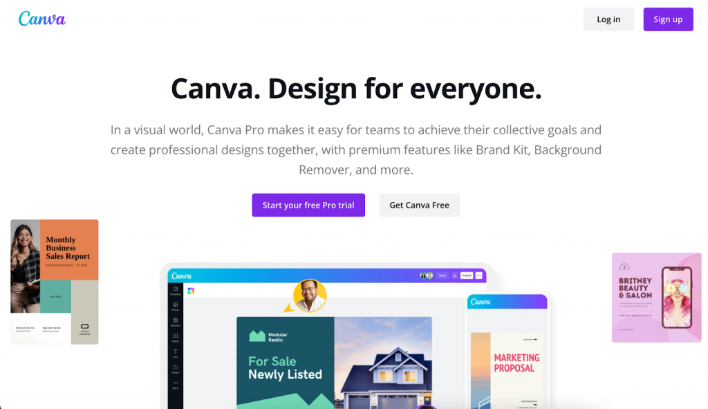
What we like about it?
- Attractive and straightforward design: The landing page uses bright colors and an abundance of white space that accentuates the text and makes the page visually appealing.
- Clear value proposition: The headline and text on the page effectively communicate Canva’s purpose as an easy-to-use graphic design tool.
- Encourages sign-ups: The page includes a prominent call-to-action (CTA) button that encourages visitors to start a free trial or sign up for an account.
- FAQ section: The inclusion of a FAQ section demonstrates that Canva is open to questions and willing to provide additional information to potential customers. This can help build trust and increase the likelihood of a sign-up.
In conclusion, landing pages are a crucial component of any online marketing strategy. They are the first point of contact for potential customers, and a well-designed landing page can greatly increase the chances of converting visitors into customers.
The landing page design ideas provided in this article offer a wealth of proven elements and inspiring template examples that can help you create high-converting landing pages for your business. However, it’s important to remember that a great landing page is not the only step in driving targeted traffic and sales to your website.
A comprehensive content marketing strategy is also essential to promote your business online. With the right approach, you can reach your target audience and drive conversions.
If you are looking for a way to promote your business online and drive hyper-targeted traffic and sales, consider working with AmpiFire’s content marketing services.
Our team of experts will help you create a strategy that will take your business to the next level. So, take a step ahead and reach out to us for a consultation and let us help you achieve your goals.
Author
Related Posts
Category Design Examples & Ideas to Own a Market
Key Takeaways Category design transforms existing concepts into ownable market positions – from Dave Asprey’s “Bulletproof Coffee” to Athletic Greens’…
BigCommerce Brand About Us Page: Writing Guide, Template & Content Examples
Unlock the secret to building trust and boosting sales with an effective BigCommerce Brand About Us Page step-by-step guide and…

BigCommerce Landing Page Optimization Guide: Key Strategies For Increased Conversions
Master the art of conversion rate optimization with this comprehensive guide on enhancing your BigCommerce landing page through strategies like…

Best YouTube Thumbnail Guide: Examples & Best Practices 2026 for High CTR
Key Findings: Thumbnail Research: Here at AmpiFire we did extensive research across several published studies, top channels and our own…
3 MSN Guest Post Ideas For E-com, Real Estate, Law & More With Examples
Explore 3 MSN guest post ideas for industries like e-commerce, real estate, and law, complete with examples to enhance your…

Manual Link Outreach Process: How To Build High Authority Niche Blog Backlinks & Examples
Learn how to gain access to 10K+ sites without breaking the bank with our step-by-step guide to high-authority link outreach