
Article at-a-glance:
– Conversion optimization is the key to success in increasing sales and revenue, and there are proven CRO tactics that can help you boost your conversions and sales.
– Increasing the time visitors spend on your website can boost your content marketing results and website engagement metrics, fostering an environment for eCommerce conversion rate optimization.
-The Ultimate eCommerce CRO Checklist includes optimizing your site, checkout, product pages, introducing omnichannel marketing, and improving website engagement metrics.
-Dive in to discover actionable steps to ensure your customers’ journey is seamless, compelling, and conversion-focused.
Benefits of Conducting an E-commerce Store Audit
Navigating the e-commerce landscape without a roadmap? An audit is your compass. Here’s why conducting an e-commerce store audit is the first and non-negotiable step when it comes to optimizing your store and maximizing sales:
- Spot Weaknesses: Unearth hidden bottlenecks that hinder conversions and usually cause ecommerce stores to fail.
- Understand Customers: Gain insights into your audience’s behavior and preferences.
- Improve Brand Exposure: Increase online brand exposure to stand out in the crowded marketplace.
- Boost ROI: Identify areas where you can get more bang for your buck.
- Enhance User Experience: Pinpoint usability issues and streamline the shopping journey.
- Stay Competitive: Keep up with industry standards and outpace competitors.
- Increase Sales: By addressing pain points, you pave the way for more purchases.
- Build Trust: Ensure your store is secure, credible, and reliable for shoppers.
- Optimize Marketing Efforts: Refine strategies based on real data, not just hunches.
- Reduce Cart Abandonment: Understand why customers bail and how to reel them back in.
Overall E-commerce Store CRO Checklist
General
Your website’s general appearance and functionality set the tone for user experience. Here’s how to make it flawless:
- Ensure main pages (home, landing, product) load in 5 seconds or less.
- Incorporate a CTA on every page, even on 404 error pages and blog posts.
- Make clickable elements obvious with hover states, rounded corners, and blue underlined links.
- Cookie notifications should be easily closed/approved within 2 seconds.
- Offer wishlists as a preliminary step in the checkout process.
- Use verb-time labels for buttons and links, like “Shop Now”.
- Non-clickable items shouldn’t appear clickable.
- Maintain ample space between action targets to avoid user errors.
- Offer upsell opportunities between checkout and thank you pages without re-entering payment info.
- Consistently place the shop’s logo; clicking it should return users to the home page.
- Use micro-animations to emphasize the main CTA.
- Avoid ill-timed pop-ups.
- Promote site-wide offers (e.g., key holiday offers) on the home page with urgency triggers and linked CTAs.
- Ensure a prominent top bar with a clear CTA for site-wide offers.
Navigation
A user-friendly navigation system can make or break a user’s shopping experience. Ensure yours is intuitive and efficient:
- Provide clear navigational feedback.
- Ensure category labels are accurate.
- Arrange navigation items logically, with less crucial info at the bottom.
- Exclude unnecessary links from main navigation.
- Implement sticky navigation for easy access.
Search Bar
A user-friendly navigation system can make or break a user’s shopping experience. Ensure yours is intuitive and efficient:
- Position a prominent search box at the top or top-right on the home page.
- Enable auto-complete and auto-suggest features.
- Ensure search results are clear, useful, and ranked by relevance.
- Offer suggestions for zero-result searches.
- Cater to common queries effectively.
- Provide search hints like verb + item (e.g., “men’s hat”).
- Ensure the search box is adequately long and responsive to the Enter key.
- Incorporate a recognizable “magnifying glass” icon.
- Offer hints of recent or trending searches upon clicking the search field.
- Implement automatic spell checking and search for plurals and synonyms.
Cart Widget in the Header
A robust search function empowers users to find exactly what they’re looking for. Optimize yours with these guidelines:
- Ensure the cart widget is accessible on every page, ideally in the top-right corner.
- The mini cart should display total price, discount, item count, and items on hover.
- Clearly state the distance to free shipping, if available.
- Provide visible links to the basket and checkout on the mini-cart.
- An empty cart should have a CTA like “Shop our best-sellers”.
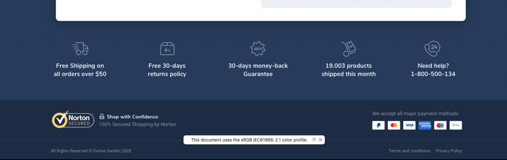
Footer
The footer is more than just an afterthought; it’s a trust-building tool and a navigation aid. Here’s how to maximize its potential:
- Include a “Back to top” link.
- Showcase the real organization behind the site, like a physical address.
- Make return policy, privacy policy, and terms & conditions easily accessible.
- Display trust icons and reassuring copy.
- Link to social networks with a total count of likes/followers.
- Provide links to main categories.
1. Homepage CRO Checklist
General Homepage
Your homepage is the storefront of your digital shop. It’s the first impression, and we all know how much that counts. Ensure it’s optimized for maximum impact:
- Promote site-wide offers prominently, using urgency and scarcity triggers.
- Maintain a professional, uncluttered design that leaves a positive first impression.
- Clearly showcase the main products on offer.
- Adhere to a clear and straightforward visual hierarchy.
- State the value proposition clearly, perhaps with a tagline or welcome blurb.
- Use meaningful, high-quality graphics over generic clip art or model images.
- Feature one or two prominent CTAs above the fold with relevant copy, like “Start Shopping”.
- Highlight specific deals or special offers near the top.
- Emphasize the unique benefits of shopping with you.
- Prioritize showcasing main product categories with descriptive photos.
- Utilize special category pages (e.g., best-sellers, new arrivals) to engage shoppers.
- Feature a curated list of essential products with links.
- Provide easy contact options, like live chat or email.
- Display recently viewed items for returning visitors.
- Share the founders’ story, mission, and vision.
Store Social Proof
Trust is currency in e-commerce. Bolster your credibility with these social proof elements:
- Feature general customer reviews or specific product reviews with product links.
- Showcase overall store ratings from reputable review platforms.
- Display awards, trust badges, and certificates earned.
- Highlight any PR exposure with logos of news sites, blogs, or celebrity endorsements.
- Showcase logos of renowned brands associated with your store.
- Incorporate user-generated photos, possibly sourced from platforms like Instagram.
2. Category Page CRO Checklist
General Category Page
Your category page is the gateway to your product range. It should be intuitive, user-friendly, and designed to guide shoppers towards a purchase:
- Allow users to sort the page by various criteria like price, best-sellers, new items, popularity, or discounts.
- Position the sorting feature in the top-right corner above the product list/grid.
- Ensure clear and comprehensible (sub)category names.
- Use the appropriate design for the category page: grid view for image-focused items and list view for attribute-focused items.
- Display the exact number of products available on each page, whether filtered or not.
- Incorporate a page description section (around 400 words) at the top (mostly hidden with a “Read more” option) or at the bottom for SEO.
- Maintain the same vertical position when navigating between product and category pages.
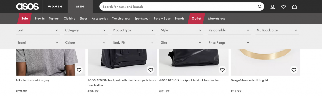
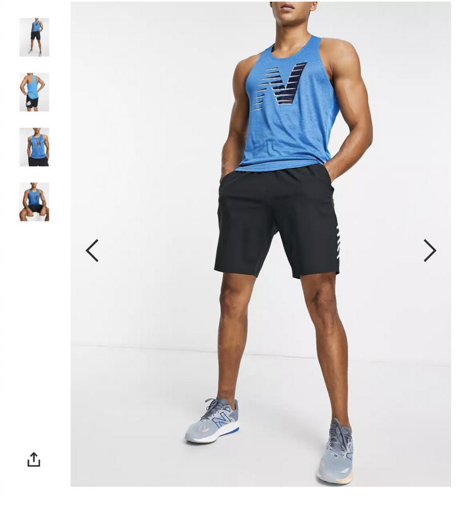
Product Card
The product card is a snapshot of what you’re offering. It should be visually appealing, informative, and drive action:
- Display 3-4 relevant products per row.
- Prioritize trending, top-rated, and best-selling items at the top of each category.
- Reveal additional product photos on mouse hover.
- Use a consistent style and size for images and product cards for better scannability.
- Clearly indicate available product variants (size, color) for each item.
- Display all vital information: product title, old and new prices, discount, reviews, overall rating, short description, product variants, and attributes.
- Feature a CTA button, ideally on hover, to encourage users to explore the product page.
- Indicate scarcity for limited stock items (“Only 1 left”).
- Display out-of-stock items with a note (“You just missed it”) to enhance the perception of scarcity.
- Use badges on product thumbnails for quick info (e.g., “Fast delivery”, “Best-seller”).
- Allow customers to provide their email for out-of-stock products to get notified when available.
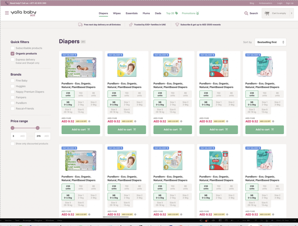
Filters
Filters streamline the shopping experience, especially for stores with a vast product range. Ensure they’re user-friendly and effective:
- Offer clear and useful filters, especially optimized for mobile use.
- Make filters prominent, especially if they’re frequently used by shoppers.
- Position popular filters at the top.
- Display only relevant filters for each category.
- Position filters consistently, either on the left or at the top below the category name.
- Auto-update the category page in real-time when a filter is selected.
- Ensure sticky product filters for easy access at any time.
- Use appropriate selectors for different filter types, like color swatches for colors or a price range slider for price selection.
3. Product Page
General Product Page
The product page is the heart of your e-commerce site. It’s where decisions are made, so it needs to be perfect:
- Use sticky navigation that hides when scrolling down but reappears when scrolling up, displaying product details and CTAs.
- Offer options for potential customers to ask questions, like live chat or phone.
- Incorporate breadcrumbs for easy navigation (not applicable for single-product stores).
- Allow customers to provide their email for out-of-stock products to get notifications.
- Ensure the back button always returns users to their previous page.
Product Overview (above the CTA area)
First impressions matter. Make sure your product shines right from the start:
- Use descriptive product titles.
- Make the main product title visually dominant.
- Ensure the product title is SEO-friendly, under 65 characters.
- Use compelling product subtitles with power words.
- Display product ratings near product titles, linked to reviews.
- Highlight key product benefits near the main title.
Image Gallery
Visuals sell. Ensure your product images are top-notch:
- Feature an attractive main product photo with zoom functionality.
- Include product videos in the gallery.
- Ensure easy navigation with arrows and support swipe actions on mobile.
- Showcase images for different product variants/sizes.
CTA Area
This is where the magic happens. Drive action with these elements:
- Make the main CTA the most visible element on the page.
- Ensure easy selection of product variants.
- Use interactive selectors for product variants and quantity.
- Provide size charts or links for products with varying sizes.
- Display localized units for products with different measurements.
- Highlight the product’s price, especially if discounted.
- Clearly indicate shipping information and additional charges.
- Use urgency and scarcity triggers effectively.
- Offer express payment options and installment options for pricier items.
Product Social Proof
Boost trust and credibility with these elements:
- Highlight any PR exposure with logos of news sites or celebrity endorsements.
- Display overall product star ratings and allow filtering by rating.
- Feature user-generated content, like photos or video testimonials.
- Indicate the number of customers and social media followers.

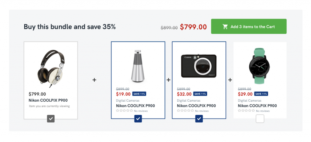
Conversion & AOV Boosters
Maximize your sales potential with these strategies:
- Offer clear quantity discounts near the main CTA.
- Promote relevant cross-sell/up-sell products.
- Use urgency and scarcity triggers effectively.
- Display real-time data on product views and purchases.
- Emphasize charitable contributions, if applicable.
- Recommend related products with a “Visitors who viewed this also viewed…” section.
Product Description
Information is power. Ensure customers have all they need to make a purchase:
- Ensure the product description is easy to read and scan.
- Group product information effectively and use bullet points for clarity.
- Use section titles that highlight product benefits.
- Clearly list all items included with the product.
- Feature customer FAQs specific to the product.
- Display technical specifications in a readable format.
- Offer product comparisons and showcase embedded reviews from social networks.
4. Landing Page CRO Checklist
General Landing Page
A landing page serves as the entry point for a specific audience segment. It’s designed to convert visitors into customers:
- Ensure the buy button directs users straight to checkout, bypassing the cart page.
- Use sticky navigation that hides when scrolling down but reappears when scrolling up, displaying product details and CTAs.
- Eliminate any outgoing links to maintain user focus.
- Provide options for potential customers to ask questions, like live chat or phone.
- Make sure you are using website visitor recognition tool to see, which company or even which person has visited your website.
5. Cart Page CRO Checklist
General Cart Page
The cart page is the final step before checkout, ensuring clarity and trustworthiness is essential:
- Maintain a clear and uncluttered cart design for easy navigation.
- Implement urgency triggers, such as reserving items for a limited time.
- Highlight free shipping achievements prominently.
- Retain items in the cart for returning users.
- Display all essential product details, including title, image, variant, quantity, and price.
- Ensure accurate product images for chosen variants.
- Allow quantity adjustments with automatic cart updates.
- Provide an easy option to remove items.
- Indicate expected delivery dates.
- Use scarcity triggers for items in limited stock.
- Offer easy access to customer support channels.
- Highlight return, refund, and money-back guarantee policies.
- Incorporate a discreet coupon code input to prevent external searches.
- Promote relevant upsell/cross-sell products with enticing offers.
- Allow customers to save products or the entire cart for later.

CTA Area
The Call-to-Action (CTA) area is where conversions happen. Make it compelling and trustworthy:
- Position the subtotal price prominently near the main CTA.
- Provide estimates for applicable taxes.
- Display total savings near the main CTA.
- Ensure the main CTA is clear about the next steps and is the most visible element.
- Duplicate the main CTA at both the top and bottom of the page for easy access.
- Incorporate trust indicators, like a lock icon, on the main CTA.
- Display trust badges or seals, reinforcing the security of the transaction.
- Offer alternative payment methods below the main CTA.
- Showcase available installment methods with clear payment details.
- Provide a secondary CTA for users who wish to continue shopping.
6. Checkout Page CRO Checklist
General Checkout Page
The checkout process is the final step in converting a visitor to a customer. It’s crucial to ensure a seamless experience:
- Allow guest checkout to avoid unnecessary registration.
- Use a progress bar to provide feedback on the checkout process.
- Clearly indicate the next steps in multi-step checkouts.
- Ensure users don’t have to start over if an error occurs.
- Display a clear order summary before finalizing the purchase.
- Reinforce trust with badges or seals, such as “Verified by Norton”.
- Eliminate distractions by removing outgoing links.
- Make the privacy policy accessible and ensure it’s clear, especially on pages requesting personal information.
- Provide easy access to customer support channels.
- Ensure the main CTA stands out on the checkout page.
Conversion & AOV Boosters
Boosting the average order value (AOV) can significantly increase revenue:
- Offer order bumps like “Urgent shipping” or “Gift packaging” at low prices.
- Implement urgency triggers to encourage prompt checkout completion.
Login & Registration
A smooth login and registration process can enhance user experience:
- Allow returning users to log in for a faster checkout process.
- Simplify the password selection process.
- Ensure an easy password recovery process.
Forms
Optimizing form design can significantly reduce cart abandonment:
- Use a single-column layout for input fields.
- Minimize the number of input fields to essentials.
- Implement “floating labels” for clarity in input fields.
- Request the user’s email address early in the process.
- Provide input field suggestions to assist users.
- Offer an option to auto-fill billing details if they match shipping details.
- Ensure easy mobile access for payment option selections.
- Use visual prompts for credit card details, like indicating the CVV code’s location.
- Enhance perceived security with a gray background for credit card inputs.
- Facilitate easy navigation between input fields using the “Tab” key.
- Optimize mobile input with appropriate keyboards for data types.
- Clearly differentiate between optional and mandatory fields.
- Clearly explain the purpose of requesting phone numbers.
- Use a street address database to prevent address errors.
- Implement inline validation for input fields.
- Ensure error messages are clear and instructive.
- Avoid redundant data entry by users.
- Utilize auto-complete functions where possible.
- Retain input data if a user temporarily leaves the checkout page.
- Allow easy content deletion in input fields with a single click.
7. Thank You Page CRO Checklist
General Thank You Page
The “Thank You” page serves as a confirmation and reassurance to customers that their transaction was successful:
- Clearly confirm the successful completion of the purchase and offer congratulations.
- Provide a concise summary of the order details.
- Clearly indicate the expected delivery date and the courier or delivery service handling the package.
- Offer easy access to customer support channels, such as live chat, email, or phone.
- Guide the user on how to track their package for added transparency.
Conversion & AOV Boosters
Maximizing the value of the “Thank You” page can lead to increased customer loyalty and revenue:
- Offer opportunities for additional purchases by suggesting complementary products or the same product at a discounted rate, emphasizing that these will be combined with the recent order.
- Provide a coupon code for future purchases, which can also be shared with friends, encouraging repeat business and referrals.
- Ensure that the confirmation email sent to the user mirrors the information on the “Thank You” page, including product summaries, upsell offers, and any provided coupon codes.
Ready to Elevate Your E-commerce Store & Sales?
E-commerce optimization is a multifaceted endeavor, encompassing every stage of the online shopping experience.
From the initial product page design, through the intricacies of the cart and checkout processes, to the final touch points on the thank you page, each element plays a crucial role in enhancing user experience and boosting conversions.
By adhering to the detailed checklists provided, online retailers can ensure they’re offering a seamless, user-friendly journey for their customers.
This not only fosters trust but also encourages repeat business and referrals.
In the ever-evolving digital marketplace, staying updated and optimizing each touchpoint is paramount for sustained success.
Schedule an appointment now with our team to see what AmpiFire can do to further supercharge your eCommerce store.
Read an interview with AmpiFire founder Chris Munch, where he shares how they help eCommerce brands achieve 30-50x ROI by distributing content across 300+ platforms. Discover the strategy that transformed one company’s monthly sales from $48K to $735K in just one year. Here’s the interview: https://www.websiteplanet.com/blog/ampifire-interview/
We repurposed this article from a Masterhack forum post:
https://www.masterhack.bg/c/seo-affilate/e-commerce-checklist
Author
Related Posts

Installing BigCommerce Stencil Store Themes: Customize Design for Seamless Ecom Experience
Learn how BigCommerce Stencil transforms your online store with faster loading speeds, customizable themes for all business needs, and best…
Setting Up Google Analytics on BigCommerce: Ultimate Guide & Checklist
Get actionable insights and data-driven success with this guide to integrating Google Analytics 4 with BigCommerce.

How to Promote Your Blog on Twitter or X: Best Practices & Examples
Learn how to promote your blog on X (formerly Twitter) with proven strategies. Increase blog traffic using threads, visuals, and…

How to Write BigCommerce Product Descriptions: Examples & Best Practices
Read our guide to learn the secrets to writing effective BigCommerce product descriptions plus examples that get results.

21 High-Converting Landing Page Design Ideas: Proven Elements & Inspiring Template Examples
Discover the essential elements of a high-converting landing page. From clear headlines to social proof, this guide will show you…

7 Ecwid Facebook Store Examples: Real-Life Implementations to Ignite Your Creativity
Explore real-life examples of successful Ecwid Facebook store implementations and gain valuable insights into creating a seamless shopping experience, leveraging…