Article at-a-glance:

- Implementing an optimized one-page checkout process can improve user experience, increase conversion rates, reduce cart abandonment, and enhance customer satisfaction.

- Developers can create fully customized checkout experiences with BigCommerce's Checkout SDK on GitHub. With the SDK, branded pages, modern delivery options, and pricing, payment, and shipping methods can be customized.

- A step-by-step process is outlined in the article for optimizing the one-step checkout process. Among the tasks are conducting research, identifying optimization opportunities, removing unnecessary form fields, improving design, and testing and refining through A/B testing and user feedback, and documenting and maintaining the changes.
Would you like to increase your online sales? You can do that by optimizing your checkout process.
In this article, we’ll explore one-step checkout and its benefits, with a focus on BigCommerce’s Optimized One-Page Checkout. Optimizing the checkout process reduces cart abandonment and increases conversions.
Here are some reasons and tips for optimizing your checkout process!
The Game-Changing Benefits of Optimized One-Page Checkout
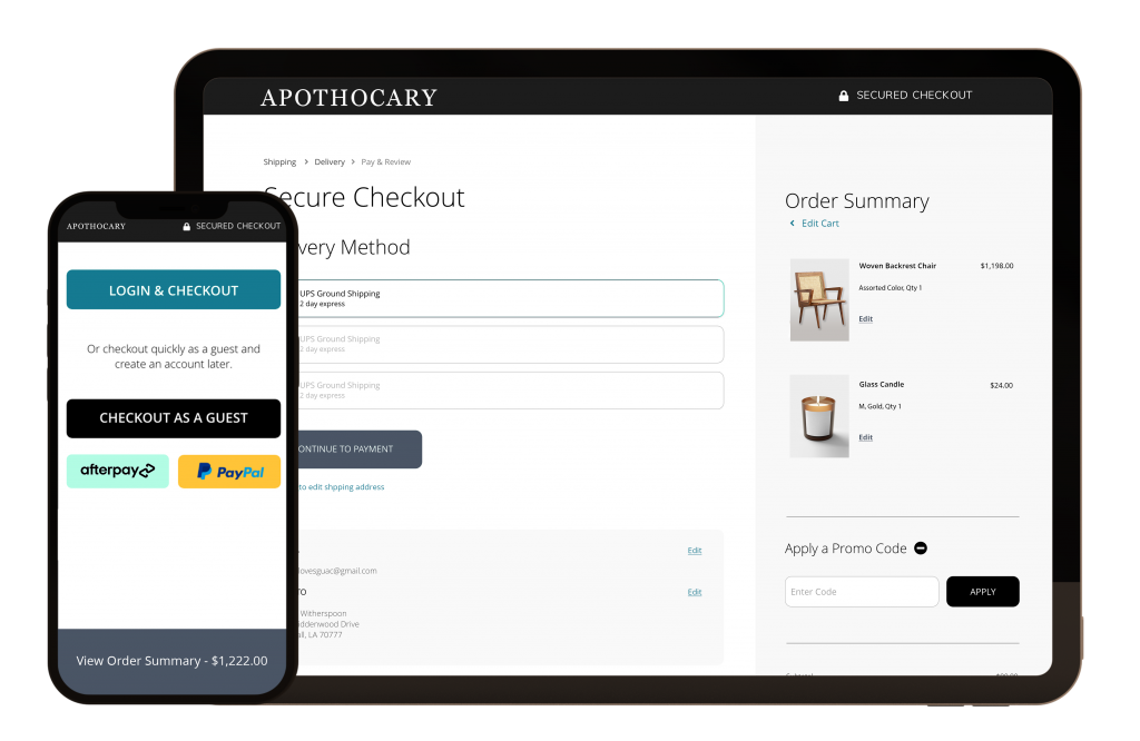
Get the most out of your eCommerce store by implementing a one-page checkout system, and create a seamless and efficient shopping experience for your customers. Here are some reasons why you should consider implementing the one-step checkout process for your BigCommerce store:
- Improved User Experience: You can say goodbye to those clunky, multi-step checkout processes with optimized one-page checkout. Instead, your customers will experience a smooth and seamless journey.
Get rid of unnecessary clicks and enjoy streamlined checkouts that make shopping easy for customers. - Increased Conversion Rates: One-page checkouts can boost your conversion rates by up to 50%! Your customers are more likely to make a purchase when your checkout process is simplified. Wouldn’t it be great to see sales rise?
- Reduced Cart Abandonment. One-page checkout rescues you with a perpetual cart feature. This means that customers can quickly access and edit items in their cart throughout the checkout process.
They won’t have to go back and start over if they need to change something. Convenience like this drastically reduces cart abandonment, keeping sales within reach. - Enhanced Customer Satisfaction: Your customers will appreciate a simple checkout process that eliminates unnecessary hurdles. You’ll get happier customers who are more likely to return for future shopping sprees because of the ease and speed of the purchase.
- Customizable Options: You can customize your one-page checkout with BigCommerce’s Page Builder tool and optimized-checkout.css file. You can add your logo, choose your colors, and build a checkout page that feels natural.
The goal is to make your customers feel at home and reinforce your brand identity.
The optimized one-page checkout is truly a game-changer that can revolutionize your business’s success.
BigCommerce Checkout SDK on GitHub
In 2021, BigCommerce introduced Open Checkout, an open-source extension that expands its native checkout functionality. Developed with the Checkout SDK, it empowers merchants, developers, and partners to craft customized checkout experiences, incorporating branded pages and modern delivery options.
Checkout JS SDK replaces the existing checkout page with a new UI you design and build. Using JavaScript, it facilitates the checkout process and interacts with the BigCommerce backend. You can customize payment and shipping providers, retrieve available options, and fetch and submit resources.
It does not allow customization of the underlying checkout model or implementation of custom payment, shipping, or tax calculation providers.
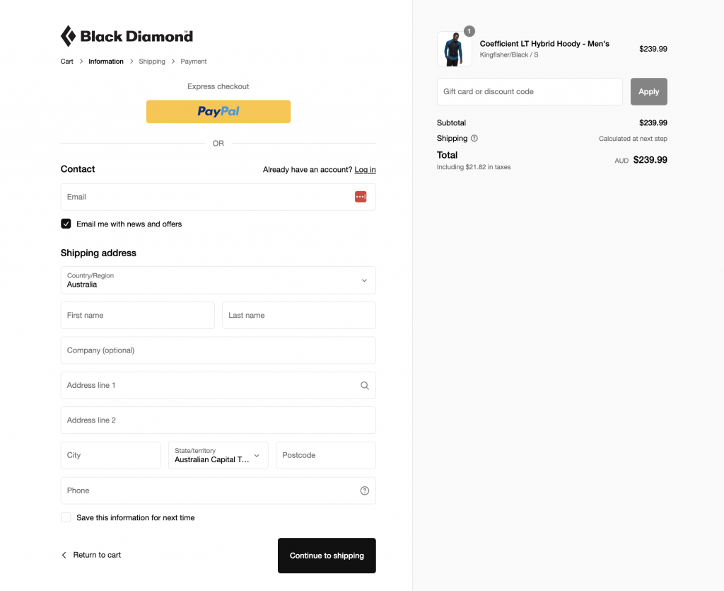
Developers looking to create their own checkout solution for their BigCommerce store will love the SDK on GitHub.
A Software Development Kit (SDK) is a set of tools, libraries, and documentation that help developers interact with a platform or service. The SDK for BigCommerce provides developers with tools and resources to create applications, integrations, and extensions.
Using the Checkout JS SDK, developers can build custom checkouts that handle heavy-lifting tasks like customer login, shipping, and payment processing.
The SDK offers incredible benefits. With custom checkout experiences, you can meet your business’s needs. You can integrate specific payment gateways or address special requirements with the SDK for seamless UI.
SDK Installation Process:
Here is a step-by-step process for putting the SDK to work for your checkout page:
- Fork and install the app as a Custom Checkout in your BigCommerce store. Most commonly, a custom checkout will be built directly into the checkout.html file, replacing the default {{{ checkout.checkout_content }}}.
- Ensure that you have Node.js version 16 or higher and NPM version 8 or higher installed on your system. Additionally, you need a Unix-based operating system—and if you are using a Mac, it’s important to keep your system optimized by removing unused tools and extensions by learning how to uninstall the easy way.
- Set up your development environment and test your checkout implementation by running the command “npm run dev:server”.
- Enter the local URL for
auto-loader-dev.jsin your Checkout Settings. This step likely involves configuring the SDK to load the necessary JavaScript file for the checkout process. - Fine-tune and refine your checkout experience until it’s just right.
And here’s the cherry on top: if you encounter any bugs or have valuable feedback, you can easily raise a GitHub Issue. You’re welcome to share your insights with BigCommerce and help make checkout even better.
One-Step Checkout Optimization Process:
a. Research and Analysis:
- Analyze your checkout process and pinpoint any pain points.
- Test and gather feedback from users to understand their expectations and preferences.
b. Identify Optimization Opportunities:
- Identify unnecessary fields in the form and remove them.
- Improve your checkout page’s design and usability.
- Make necessary adjustments to ensure mobile responsiveness.
c. Implement Changes:
- Take advantage of convenient payment options.
- Make sure the design and layout are clear and concise for the user.
- Provide a guest checkout option if necessary.
- Build customer trust through security measures.
d. Test and Refine:
- Compare the performance of the current checkout process with that of the previous checkout process through A/B testing.
- For further optimization, monitor conversion rates and user feedback.
e. Documentation and Maintenance:
- Create guidelines for future maintenance and document changes made.
- Keep an eye out for issues or improvements in the checkout process.
You can find more information and some tips for advanced setup in this Web SDK Setup Guide .
These steps will streamline and optimize the one-step checkout process for your customers.
Real-Life Examples of Optimized Checkout Pages
These examples showcase the power of simplicity and clarity in creating a seamless checkout experience:
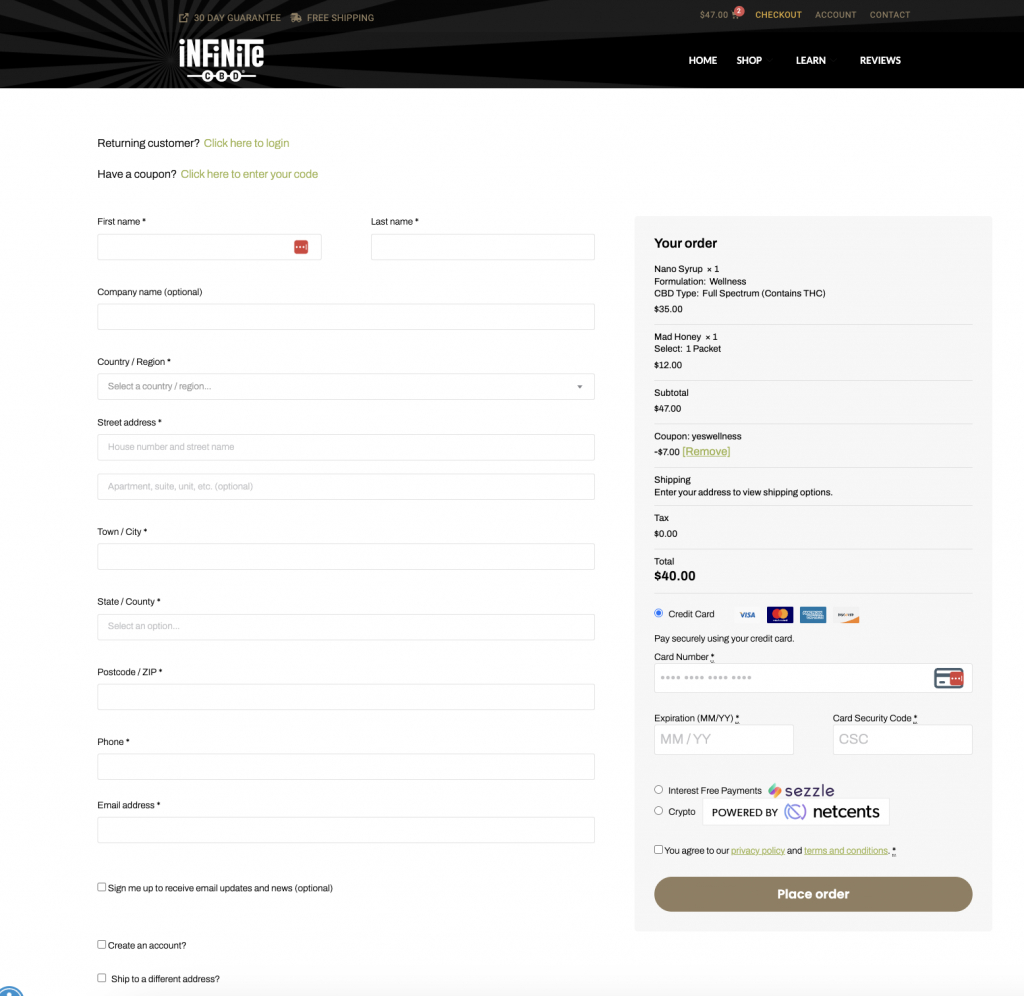
Infinite CBD
The brand specializes in CBD products for a variety of uses. You can order gummies, tinctures, topicals, and more on their checkout page. Customers can easily navigate through the options and choose their desired products.
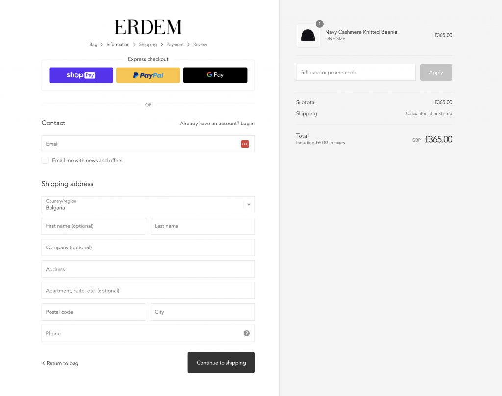
ERDEM
Fashion brand ERDEM understands the importance of a quick checkout process. The company accepts ShopPay, PayPal, and GPay as payment options. Customers have a clear and understandable order summary, with breadcrumbs illustrating the steps.
The Sill
Known for their plant delivery service, the Sill keeps things simple at checkout. Simple design elements and clear calls to action make their checkout page stand out. Customers can effortlessly complete their purchase thanks to this streamlined experience.

These examples demonstrate how optimized checkout pages provide a delightful user experience. You can take inspiration from their clear navigation, simplicity, and concise presentation of information.
These BigCommerce checkout pages are missing something, right?
One of the first things I noticed on the above checkout pages is that the forms are a bit too big.
You see, overwhelming your potential customers with lengthy forms can be a major turn-off.
Streamline those forms so that only essential information is required.
Plus, when people reach the checkout page, it’s crucial to remind them of the value they’ll be getting from their purchase. The checkout page is an opportunity to provide compelling product descriptions or testimonials that reinforce the benefits and highlight any exclusive features. It is best to have all the information on one page.
Additionally, I noticed that there’s no upsell option on these checkout pages.
This is a missed opportunity to maximize your revenue and provide additional value to your customers. With an upsell option, you can complement your main purchase with complementary products or services. It’s a win-win situation!
Remember, the easier it is for people to complete the purchase, the higher the chances they’ll follow through.
Boost Conversions with These Copywriting Hacks

These tips backed by ecommerce funnel expert Alex Fedotoff will help you craft compelling copy that guides and delights your customers on your checkout page.
- Use clear and concise copy: Make sure the text is easy to read and guides customers through the process.
- Offer guest checkout: Provide an option for guests to streamline the process and increase conversions.
- Include clear instructions and common questions: Including common questions, clear instructions and answers on the checkout page can help address any concerns or reduce any confusion customers may have before completing their purchase.
- Display trust badges and guarantees: Establish trust and credibility by including trust badges and guarantees.
- Include a thank you message: Show appreciation with a thank you message after checkout is complete.
- Use descriptive buttons: Label buttons clearly to indicate the action users will take.
- Provide a visual checkout process: Display a visual indicator of progress to keep customers informed.
- Include links to important policies: Make privacy policy, shipping details, FAQ, and returns policy easily accessible for transparency.
- Include a tickbox for an upsell: Offer a related product or service that complements the purchase of your customer to increase sales.
Create Your Own Checkout Page That Will Make Your Customers Happy & Want To Come Back Again & Again
The best checkout pages share several key elements when it comes to design. Among them are clear order details, guest checkout capabilities, multiple payment options, a wide range of delivery options, and a transparent return policy. However, what sets them apart is the creativity and execution behind them.
The key to creating a great checkout page is simplicity and ease of navigation.
To guide customers smoothly through the process, use clear, concise language. Clearly explain the steps, and provide multiple payment options to accommodate different preferences. A guest checkout feature makes it even easier for customers to complete their purchases. Compared to traditional checkout processes, the optimized one-page checkout process can increase conversion rates by up to 50%.
This impressive boost is attributed to the reduction of friction and the delivery of a seamless checkout experience for customers.
By contrast, traditional checkout processes are often lengthy and cumbersome, which can lead to cart abandonment.
The implementation of this checkout process will improve the customer experience, increase conversion rates, and reduce cart abandonment. Remember, it’s important to continually optimize your checkout process to make the shopping experience seamless and hassle-free for your customers.
Author
-
Head of Content Marketing & Branding at AmpiFire. Book a call with the team by clicking the link below.
Related Posts
How to Turn a Blog Into an Infographic: Step-by-Step Guide
Learn how to turn a blog into an infographic with our step-by-step guide. Repurpose content into engaging visuals that boost…

How to Use ChatGPT to Add Internal Links to Content, Blogs & Articles: Step-by-Step Guide
Streamline internal links in your content with ChatGPT's versatile roles, from Idea Generator to SEO Metric Analyst and boost your…

Starting an AI Content Marketing Business: Step-by-Step Guide
Launch your AI content marketing business successfully with our comprehensive step-by-step guide.

How to Turn Article into Video: Step-by-Step Guide & Tips
Learn how to turn articles into videos step-by-step. Compare AI tools vs manual methods for converting written content into engaging…

How to Turn Article into Podcast: Step-by-Step Guide & Tips
Learn how to turn articles into podcasts with AI tools, voice generation, and distribution strategies to reach audio-first audiences.

How to Write Undetectable AI Content: A Step-by-Step Guide to Making Articles Sound Human
Master undetectable AI content creation with AmpiFire's proven strategies to humanize text and bypass detection tools effectively.


