
Key Takeaways
- Blog posts with clear sections, lists, and actionable tips work best for infographic conversion because they’re already organized into visual chunks.
- Extract only the most important points from your blog; infographics should simplify information, not reproduce every word.
- Visual hierarchy guides readers through your infographic; use size, color, and positioning to show what matters most.
- AmpiFire’s AmpCast AI automatically transforms your blog content into multiple formats, including infographics, saving hours of manual design work.
Why Turn Blogs Into Infographics
Reach Visual Learners
Not everyone likes to read long blog posts. Some people learn better by looking at pictures, charts, and graphics. When you turn your blog into an infographic, you’re making the same information available in a format that works better for visual learners. This means your content reaches more people.
Increase Shareability
Infographics get shared more often on social media than text-only posts. People scroll through their feeds quickly, and a colorful, eye-catching infographic stops them in their tracks. It’s much easier to share a single image than asking someone to read a full blog post.
Repurpose Existing Content
You already spent time writing quality blog posts. Converting them into infographics gives that content a second life. You can post the infographic on different platforms, reach new audiences, and get more value from work you’ve already done.

How AmpiFire Works:
- Research & Target: Find high-demand topics your buyers search for
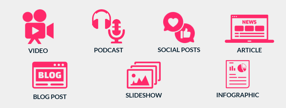
- Create & Repurpose: AmpiFire’s AmpCastAI generates news articles, blogs, videos, podcasts, infographics, slideshows, and social posts
- Distribute & Amplify: Auto-publish to 300+ sites including Google News, YouTube, Spotify, and major news networks
Get more traffic from people who want to buy your stuff, and powerful “As Seen On” trust badges for your site.
Do It Yourself (with AI), Done For You Content, & 100% Managed Organic Growth options available.
Grow Your Free Traffic From Everywhere
What Makes a Blog Post Good for Infographics
Not every blog post works well as an infographic. Look for blogs with clear sections, bullet points, and actionable tips that can be converted into visual elements. The best candidates include:
1. Data-Driven Content: Blog posts with numbers, comparisons, or survey results translate perfectly into charts and graphs.
2. List-Based Articles: “10 Ways to…” or “5 Steps to…” posts already have a natural structure that works as an infographic.
3. How-To Guides: Step-by-step instructions become visual flowcharts that are easier to follow than paragraphs of text.
4. Comparison Posts: When you’re comparing options, products, or methods, visual side-by-side comparisons make the differences clearer.
What You Need Before Starting
Before you open any design tool, prepare your content first. Read through your entire blog post and highlight the most important sentences. Write down the main ideas in your own words, keeping each point to one or two short sentences.
Think about how the information flows. Does it follow a timeline? Does it compare two things? Is it a process with steps? Understanding the structure helps you choose the right infographic layout later.

Step-by-Step Process to Convert Your Blog
Step 1: Extract Key Information from Your Blog
Begin by finding a blog post with valuable information that lends itself to visualization. Read through your blog and pull out only the essential facts. An infographic isn’t meant to include everything from your blog; it should highlight the most valuable points.
Look for headings, subheadings, important statistics, quotes, and main takeaways. If your blog is about healthy eating, you might extract “5 benefits of drinking water” instead of reproducing all the explanation paragraphs.
Step 2: Organize Information into Visual Sections
Group related information together. If you extracted ten points, see if some of them belong under the same category. This organization creates natural sections in your infographic.
Write short, punchy headlines for each section. Instead of “There are many reasons why people should exercise regularly,” use “Why Exercise Daily?” Keep it simple and direct.
Step 3: Choose Your Infographic Layout
Think about the best way to effectively communicate your key points and use a combination of text, icons, illustrations, and data visualization techniques. Different types of information need different layouts:
Timeline Layout – Perfect when your content follows a sequence or shows events over time.
Comparison Layout – Best for showing differences between two or more options.
List Layout – Works great for tips, benefits, or step-by-step processes.
Statistical Layout – Use this when your blog has lots of numbers and data to showcase.
Step 4: Select Colors and Fonts
Stick to two fonts: one for the title and one for the headings and body text. A playful font for your title adds interest, but keep your body text clean and simple so people can read it easily.
Choose colors that work together. Most design tools offer pre-made color palettes. Pick three to five colors and use them consistently throughout your infographic. Make sure there’s enough contrast between your text and background so everything stays readable.

Step 5: Add Icons and Visual Elements
Icons replace words and make your infographic more interesting to look at. Instead of writing “email marketing,” use an envelope icon with those words. Canva has an extensive range of templates and thousands of illustrations you can use to bring your content to life.
Make sure all your icons match in style. Don’t mix cartoon-style icons with realistic photographs; it looks messy. Choose one visual style and stick with it throughout.
Step 6: Design the Flow
Organize your infographic in the way people naturally read. Start with the most important information at the top, then guide your reader left to right and downward so it’s clear and easy to follow.
Use size, color, and positioning to guide the viewer’s eye through the content. Ensure the most important information stands out prominently. Make your title the biggest element. Use larger fonts or brighter colors for key points you want people to remember.
Leave white space between sections. Don’t cram everything together. White space gives readers’ eyes a place to rest and makes your infographic less overwhelming.
Step 7: Optimize for Sharing
Make sure your infographic includes appropriate branding, such as your logo, website URL, and social media handles. Place these elements where people can see them but they don’t distract from the main content.
For blog posts, infographics should be around 663 x 2000 pixels. This vertical size works well on websites and social media platforms. Save your infographic as a PNG file for the best quality.
Best Practices for Blog-to-Infographic Conversion
1. Keep Text Minimal: Limit words in an infographic to concise statements that create maximum impact. If you’re using more than a few sentences per section, you’re probably including too much.
2. Use Data Visualization: If the selected blog includes data, visualize this information using charts, graphs, or diagrams. Numbers in charts are easier to understand than numbers in sentences.
3. Maintain Brand Consistency: Use your brand colors, fonts, and logo so people recognize the infographic came from you. This builds trust and drives traffic back to your website.
4. Test Readability: Show your infographic to someone who hasn’t read your blog. Can they understand the main points in less than a minute? If not, simplify it more.
Common Mistakes to Avoid
- Including Too Much Information: The biggest mistake is trying to fit your entire blog into one infographic. Remember, the goal is to simplify, not summarize everything. Choose only the most important points.
- Poor Color Choices: Using too many colors or colors that clash makes your infographic hard to read. Stick to a simple color palette with good contrast.
- Inconsistent Visual Style: Mixing different icon styles, fonts, or graphic types makes your infographic look unprofessional and confusing.
- Ignoring Mobile Viewers: Many people will see your infographic on their phones. Make sure text is large enough to read on small screens.
- Forgetting Your Call-to-Action: Always include a way for people to learn more, whether that’s your website URL, social media handle, or a link to the full blog post.
Transform Your Content with AmpiFire’s AI-Powered Automation
Creating infographics manually takes time you might not have. You need to extract key points, design layouts, choose colors, find icons, and format everything perfectly. This process can take several hours for each infographic.
Our AmpCast AI platform solves this problem by automatically transforming your blog posts into multiple content formats, including professionally designed infographics. You don’t need any design skills or expensive software.
Here’s how it works: Upload your blog post to AmpCast, and our AI analyzes the content to identify the most important points. It then creates a custom infographic that highlights your key messages with appropriate icons, colors, and layouts. The entire process takes minutes instead of hours.
But we don’t stop at infographics. AmpCast AI also converts your blog into news articles, social media posts, slideshows, podcasts, and video clips. Each format is optimized for different platforms and audiences.
Once your content is ready, we automatically distribute everything across our network of over 300 high-authority platforms, including social media sites, news websites, and industry publications. Your infographic appears where your audience already spends time, without any manual posting from you.
The benefits are clear: instead of spending hours creating a single infographic, you get multiple professional formats and automatic distribution. This lets you focus on creating great blog content while we handle turning it into shareable visual assets.
Frequently Asked Questions (FAQ)
What type of blog posts work best for infographics?
Blog posts with a clear structure work best. Look for posts with lists, steps, comparisons, or data points. How-to guides, tip lists, and educational content convert well because they’re already organized into distinct sections.
Do I need design skills to create infographics?
No. Modern tools like Canva, Piktochart, and Adobe Express are built for people with no design experience. They offer templates you can customize by simply changing text and colors. Just drag and drop elements where you want them.
How long should my infographic be?
Vertical infographics work best for blogs and social media. Aim for a size that fits on a single screen when scrolling, but can be longer if needed to include all important information. Quality matters more than length.
Should I include all my blog content in the infographic?
Never include everything. An infographic should highlight the most valuable points from your blog, not reproduce it entirely. Think of your infographic as a visual summary that makes people want to read the full blog post.
How does AmpiFire’s automated infographic creation work?
AmpCast uses AI to read your blog post, identify the key points, and generate a professional infographic automatically. Our system selects appropriate layouts, icons, and colors based on your content. You can customize the result or use it as-is. We then distribute it across hundreds of platforms automatically, saving you hours of manual work every week.
Author
Related Posts

How to Turn Article into Video: Step-by-Step Guide & Tips
Learn how to turn articles into videos step-by-step. Compare AI tools vs manual methods for converting written content into engaging…

How to Turn Article into Podcast: Step-by-Step Guide & Tips
Learn how to turn articles into podcasts with AI tools, voice generation, and distribution strategies to reach audio-first audiences.

How to Turn Your Podcast Into a Blog Post: 7 Easy Steps
Learn how to turn your podcast into a blog post with 7 easy steps. Repurpose audio content to reach more…

Starting an AI Content Marketing Business: Step-by-Step Guide
Launch your AI content marketing business successfully with our comprehensive step-by-step guide.

How to Use ChatGPT to Add Internal Links to Content, Blogs & Articles: Step-by-Step Guide
Streamline internal links in your content with ChatGPT's versatile roles, from Idea Generator to SEO Metric Analyst and boost your…

How to Write Undetectable AI Content: A Step-by-Step Guide to Making Articles Sound Human
Master undetectable AI content creation with AmpiFire's proven strategies to humanize text and bypass detection tools effectively.