

Key Takeaways
- The four best blog-to-infographic converters in 2026 are AmpiFire (AmpCast AI) and Visme on the paid side, plus Canva and Piktochart on the free side.
- Canva Free gives the most editing control and template choice, while Piktochart Free turns pasted blog text into a draft in under 10 seconds and comes with 60 free monthly credits.
- Among the paid options, AmpiFire (AmpCast AI) builds the infographic from your topic and publishes it for you, while Visme starts at $12.25 per person per month with premium templates and a Brand Kit for consistent fonts, colors, and logos.
- Free plans suit the occasional infographic, but paid tiers from about $12 to $18 a month remove watermarks, raise usage limits, and lock in brand control.
- AmpiFire AmpCast AI turns one blog topic into an infographic plus 7 other formats, then publishes them across 300+ sites, so your content earns traffic instead of sitting unseen.
What Is the Best Blog-to-Infographic Converter?
The best blog-to-infographic converter depends on whether you are paying for design or paying for reach. Among paid tools, AmpiFire (AmpCast AI) builds the infographic from your topic and publishes it for you, while Visme gives owners and agencies premium templates and brand controls from $12.25 per person a month on the yearly plan. Among free tools, Canva offers the most editing control, and Piktochart produces the fastest draft from pasted blog text.
Pricing is only half the decision. All three design tools now meter their AI features with monthly credits rather than unlimited generation, so anyone building infographics weekly will hit a cap on the cheaper tiers. The question that settles the choice is simple: do you only need the design file, or do you need people to see it?
If being seen matters as much as the design, AmpiFire (AmpCast AI) is built for the step the other tools leave to you. It turns your blog topic into an infographic and 7 other formats, then distributes them so the graphic pulls in traffic instead of sitting on one page.

How AmpiFire Works:
- Research & Target: Find high-demand topics your buyers search for.
- Create & Repurpose: AmpiFire’s AmpCast AI generates news articles, blog posts, interview podcasts, longer informational videos, reels/shorts, infographics, flipbooks/slideshows, and social posts.
- Distribute & Amplify: Auto-publish to 300+ sites, including Google News, YouTube, Spotify, and major news networks.
Get more traffic from people who want to buy your stuff, and powerful “As Seen On” trust badges for your site.
Do It Yourself (with AI), Done For You Content, & 100% Managed Organic Growth options available.
Grow Your Free Traffic From Everywhere
Best Blog-to-Infographic Converters: Paid & Free Options
1. AmpiFire’s AmpCast AI (Paid)
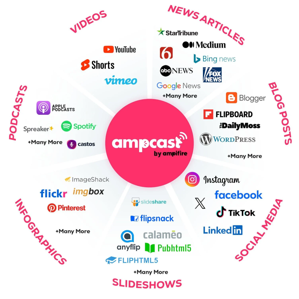
AmpiFire is the pick for owners and agencies who want the infographic to bring in traffic, not sit unused as a file. You start with a single blog topic, and AmpCast AI, our own technology, turns it into a finished infographic. That gives you the same kind of visual a design tool would, without the manual setup.
The difference is that AmpiFire does not stop at the infographic. That same topic is also built into 7 more formats, including news articles, blog posts, podcasts, videos, reels, slideshows, and social posts, and then published for you across 300+ sites. Your infographic becomes one part of a wider campaign instead of a standalone download.
Because everything runs from research to publishing, it suits businesses and marketing agencies that would rather skip the design and editing themselves. It is a paid service, with entry plans from $397 a month and fully managed options for hands-off growth.
On Trustpilot, AmpiFire holds a 4.6-star rating, with users praising its consistent distribution, responsive support, and the time saved by publishing a single topic in multiple formats at once. Reviewers who rate it lower usually point to the learning curve in the first few campaigns before results build.
2. Piktochart (Free)

Piktochart is the most direct text-to-infographic tool. You describe a topic, paste text, or upload a document, and its AI builds an editable infographic draft in under 10 seconds, which you then refine in the editor. That makes it a quick fit for repurposing a blog post into a clean, summarized visual with little setup.
Piktochart handles statistical, timeline, process, and comparison layouts well, and you can link spreadsheets so charts update with your data. The free plan includes full template access and 60 AI credits each month, with credits allocated per feature.
While the Piktochart Free plan is worth it for users who don’t post infographics often, once your posting frequency increases, upgrading to their paid tiers is required. Piktochart Pro is $15 per member/month, and Business is $20 per member/month. Custom pricing is also available for the Enterprise plan.
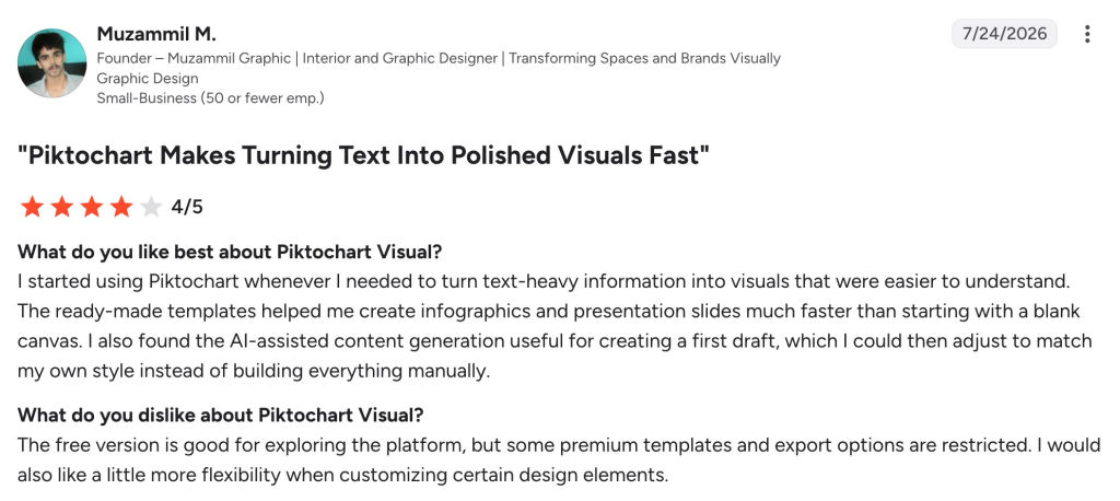
The tool sits at 4.4 stars on G2 and 4.8 on Capterra, with reviewers liking the quick AI drafts and template range, and mid-range reviews flagging limited chart customization and occasional lag on complex designs.
3. Visme (Paid)

Visme is the paid design tool to pick if you want to build infographics that look on-brand every time. It has a dedicated infographic maker with premium templates, chart and data widgets that link to live spreadsheets, and a Brand Kit that holds your fonts, colors, and logo so every graphic matches without manual setup.
There is no button that pastes a blog URL and converts it for you. Instead, Visme turns a post into an infographic through a hands-on workflow, where you first trim your blog down to its key points, then pick a ready-made template that fits the content. From there, you drag and drop content blocks to lay out the main ideas, statistics, and lists as visuals.
Starter costs $12.25 per person per month on the yearly plan ($147/year) and covers premium assets plus JPG, PNG, and PDF exports. Pro is $24.75 per person per month ($297/year) and adds PPTX, HTML5, video, and GIF exports, Brand Kit, and analytics. Enterprise is custom-priced from 10 users.
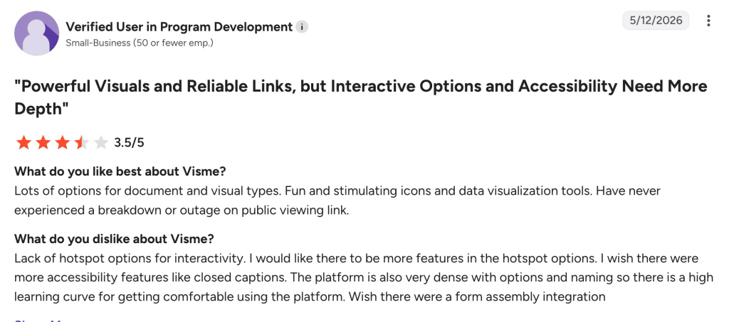
Visme sits at 4.5 stars on G2, where reviewers like the template range, interactive chart options, and reliable public viewing links, while common complaints cover premium assets being locked behind higher paid tiers, limited hotspot interactivity, a steep learning curve, and a lack of accessibility features like closed captions.
4. Canva (Free)
Canva is the most flexible free option, and the one most people already know. You start from an infographic template or a blank canvas, then build the graphic with a drag-and-drop editor, a charts tool, and millions of stock assets. Its Magic Studio AI features, like Magic Design for instant layout generation and Magic Write for in-canvas copywriting, can turn a short prompt into a full editable layout and help tidy up the wording inside the design.
For blog content, the usual workflow is to paste your key points, ask Magic Design for a layout, then drop in your brand colors and icons. Canva does not have a single “paste a whole blog post” button, so it needs more manual trimming, but the editing control and asset library are worth it for teams that design a lot.
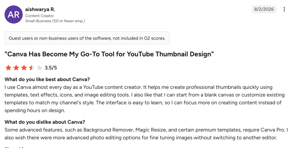
The free plan is generous for light use. Canva Pro costs $18/month (or $144/year) and adds the premium library, background remover, brand kits, and full Magic Studio access, while Canva Business is $25 per user/month. Canva has a 4.7/5 rating on G2, where users praise its ease of use and extensive template library; reviewers who mark it down mention premium assets sitting behind the paid plan and per-seat team pricing adding up.
Free vs Paid Plans: What You Get
If your goal is the occasional infographic, the free plans on Canva and Piktochart are enough. Canva Free gives you templates, the editor, and basic exports. Piktochart Free adds 60 monthly AI credits, so you can test its text-to-infographic feature before paying. Both let you publish a simple graphic to a blog or social post at no cost.
Paid plans mainly buy three things: brand control, more AI usage, and cleaner output. Brand kits keep your colors, fonts, and logo consistent across every graphic, which saves real time once you produce visuals regularly. Higher AI credit limits matter once you make infographics weekly rather than monthly. Paid tiers also remove watermarks and unlock higher-resolution and transparent exports for print or web.
AmpiFire is not part of this free-versus-paid split in the same way, because it is a managed service rather than a design tool you run yourself. The cost covers the research, creation, and publishing being handled for you, which often works out cheaper than an in-house content team or paying a separate agency for each channel.
Blog to Infographic Tools Compared
| Tool | Best for | Free plan | Starting paid price | How it makes the infographic |
| AmpiFire (AmpCast AI) | Reach and organic traffic | No | From $397/month | Creates it from your topic in 8 formats and distributes it for you |
| Visme | On-brand design at volume | Yes (10 AI credits) | $12.25 per person/month (yearly plan) | Infographic templates plus AI Designer layouts and Brand Kit controls |
| Canva | All-round design with full control | Yes | $18/month (Pro) | Magic Design layout from a prompt, plus manual editing and templates |
| Piktochart | Fast AI drafts from blog text | Yes (60 AI credits) | $15 per member/month | Paste text or upload a doc, AI builds a draft in seconds |
Where AmpiFire Fits in Your Infographic Workflow
For a quick, free graphic, Piktochart gives you the fastest draft, and Canva gives you the most control over the final look. Visme is the paid step up when brand consistency matters more than speed. All three are strong picks if your infographic only needs to live on your blog or social feeds, since their job ends once the file is made.
We built AmpiFire for what comes next, without cutting corners on the graphic itself. AmpCast AI builds a high-quality infographic from your topic, then turns that same topic into 7 more content formats and publishes them to 300+ platforms for you. That way, one topic pulls visitors back from search, social media, video, and podcasts all at once. If you want strong content and the reach to match, you can start a campaign with AmpCast AI.
Frequently Asked Questions (FAQs)
Can I turn a blog post into an infographic for free?
Yes. Canva and Piktochart both have free plans that let you build an infographic from your content, and Piktochart includes 60 monthly AI credits for its text-to-infographic feature. Free plans add watermarks or limit some exports, so people who publish often usually move up to a paid tier.
How long is a typical blog infographic?
Most blog infographics are tall and vertical, around 663 by 2000 pixels, which fits inside a standard article column. You can resize for social platforms afterward; a Facebook post works well at around 1200 by 628 pixels. Match the size to where you plan to publish it.
Do AI infographic tools need a designer?
No. These tools are built for non-designers. The AI suggests the layout, icons, and charts from your text, and you adjust colors and wording with drag-and-drop editing. A designer can polish the result, but most users get a publish-ready graphic without hiring one.
Are AI-generated infographics good enough to publish?
Usually yes for blogs and social media. The AI draft gives you a solid structure, and a few minutes of editing for branding and accuracy makes it ready. For data-heavy or print pieces, plan extra time to check chart labels and spacing.
What makes AmpiFire different from a standard infographic maker?
Standard makers stop at the design file. AmpiFire turns your topic into 8 content formats: news articles, blog posts, interview podcasts, longer informational videos, reels and shorts, infographics, flipbooks and slideshows, and social posts. It then distributes them across 300+ sites such as YouTube, Spotify, Pinterest, and Google News, so a single topic reaches a much wider audience than a single graphic could.
*Disclaimer: Results may vary based on individual circumstances, business type, and content strategy. The time savings and outcomes mentioned are based on typical user experiences and are not guaranteed. For specific pricing and service details, please visit AmpiFire.
Author
Related Posts


6 Best Video-to-Podcast Converter Tools [Free & Paid]
Find out about the 6 best video-to-podcast converter tools, both free and paid. Compare features, pricing, and free plans to…

5 Best YouTube Video-to-Blog-Post AI Tools [Free & Paid]
Check out the 5 best YouTube-to-blog-post AI tools, both free and paid. Compare top picks like AmpiFire and GravityWrite to…


5 Best YouTube to TikTok Converter Apps [Free & Paid]
Compare the 5 best YouTube to TikTok converter apps, free and paid. AmpiFire's AmpCast AI automates the full process, from…


Best Article to Video Converter Tools [2026 Edition]
Learn the best article-to-video converters for 2026. Compare top tools like AmpCast, Synthesia, and Pictory for efficient content creation.

5 Free Infographic Submission Sites with DA Above 50 [2026 List]
Learn 5 free high-DA infographic submission sites to boost traffic and earn quality backlinks.

What are the Best Content Amplification Tools [Free & Paid]
Find the best free and paid content amplification tools to expand your reach. Learn how to choose the right platforms…